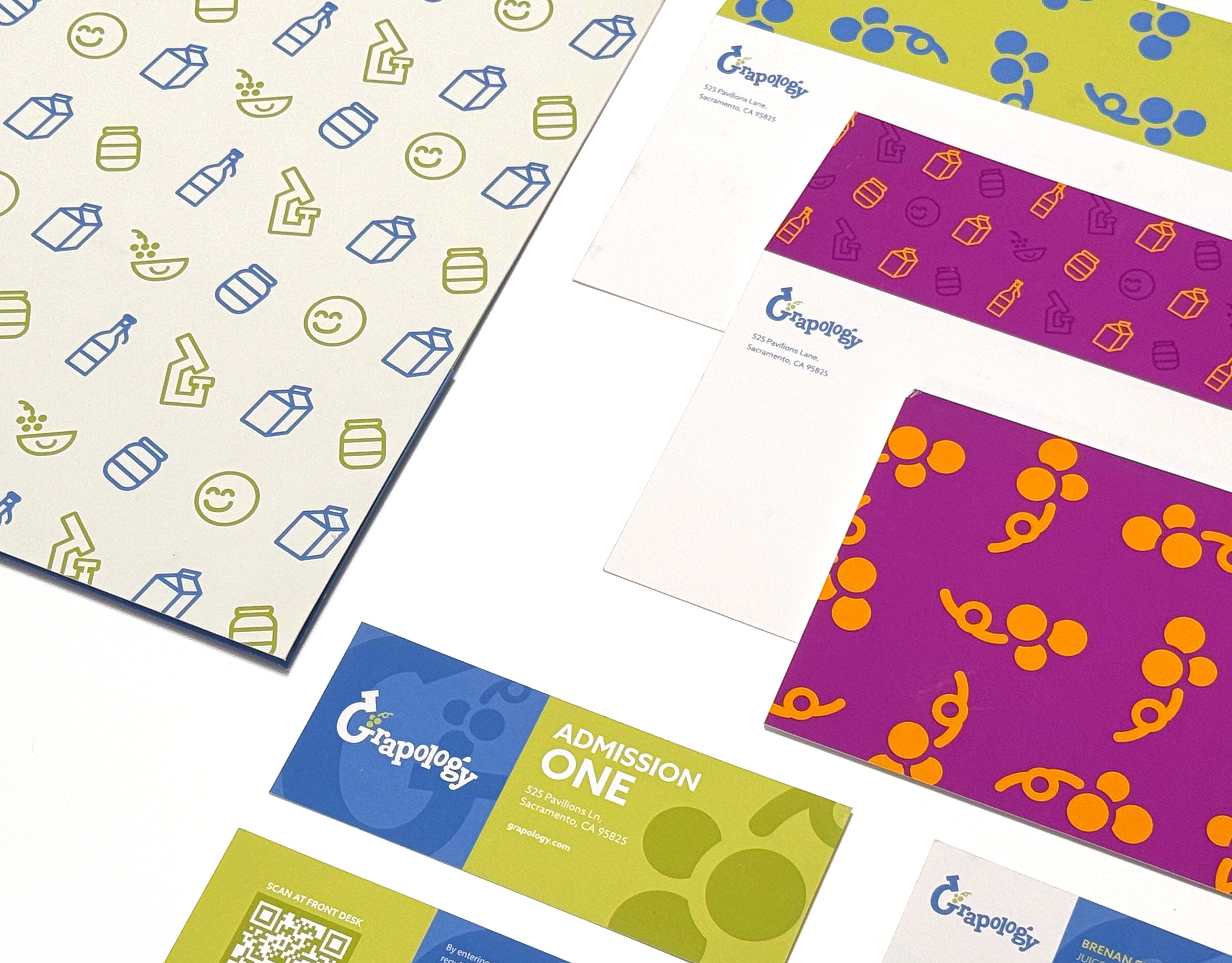
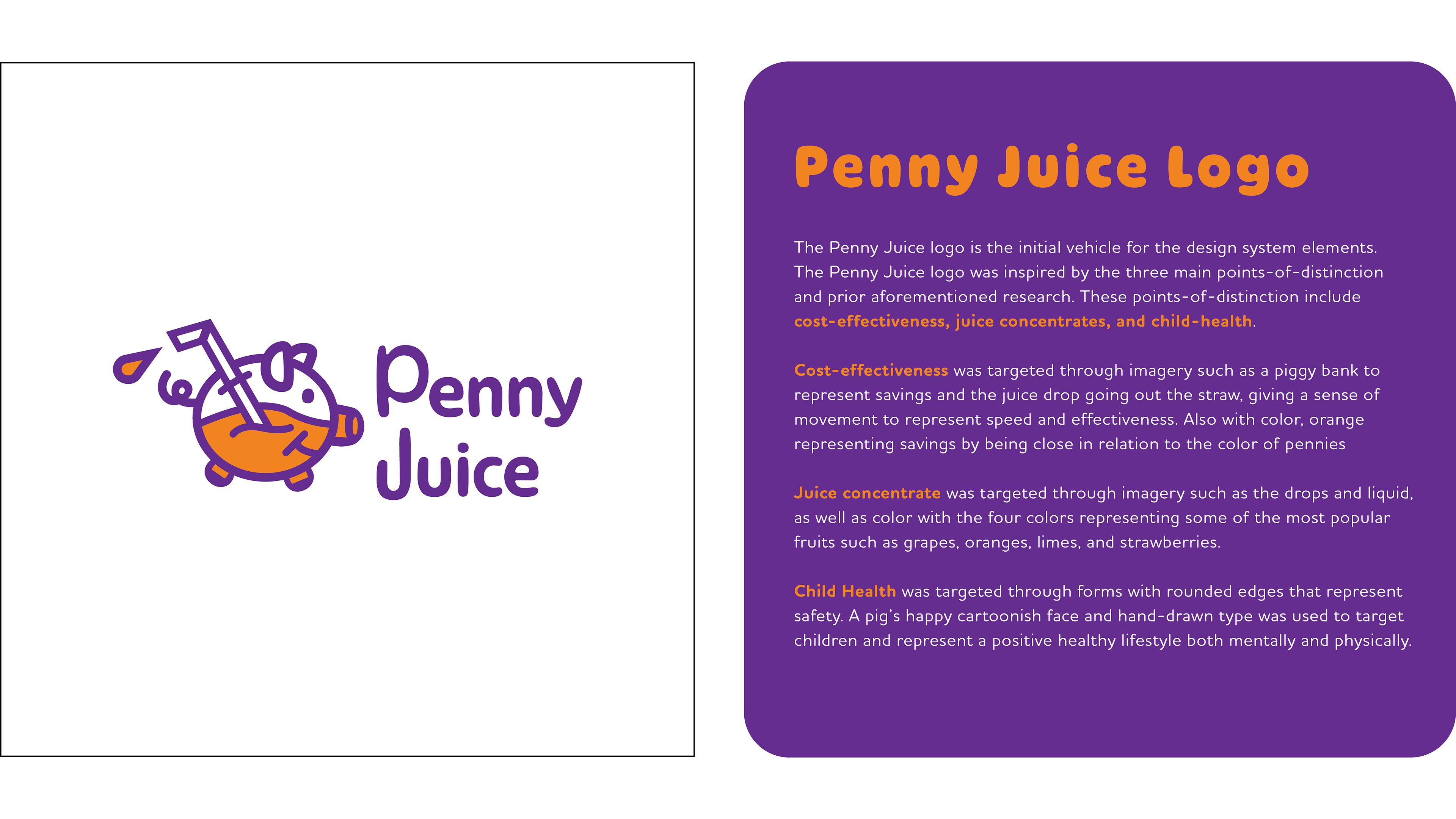
About Penny Juice
Penny Juice is a juice concentrate manufacturer with a primary focus on supplying childcare facilities such as schools and daycare centers. Penny Juice was founded in 2001 and is family-owned. They focus on using fresh ingredients, with their Juice Concentrate being composed of 100% Fruit Juice Concentrate. They pride themselves on fast delivery, offering a cheaper alternative to juice, and saving storage space.
Problem Statement
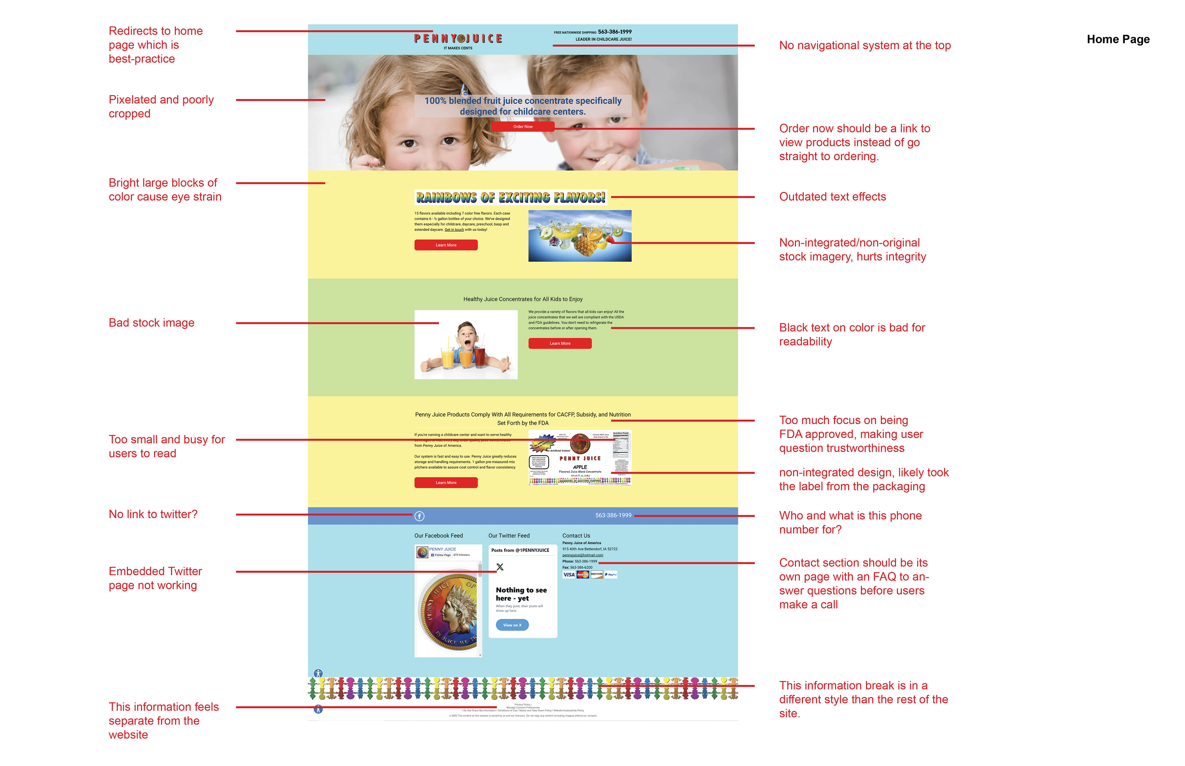
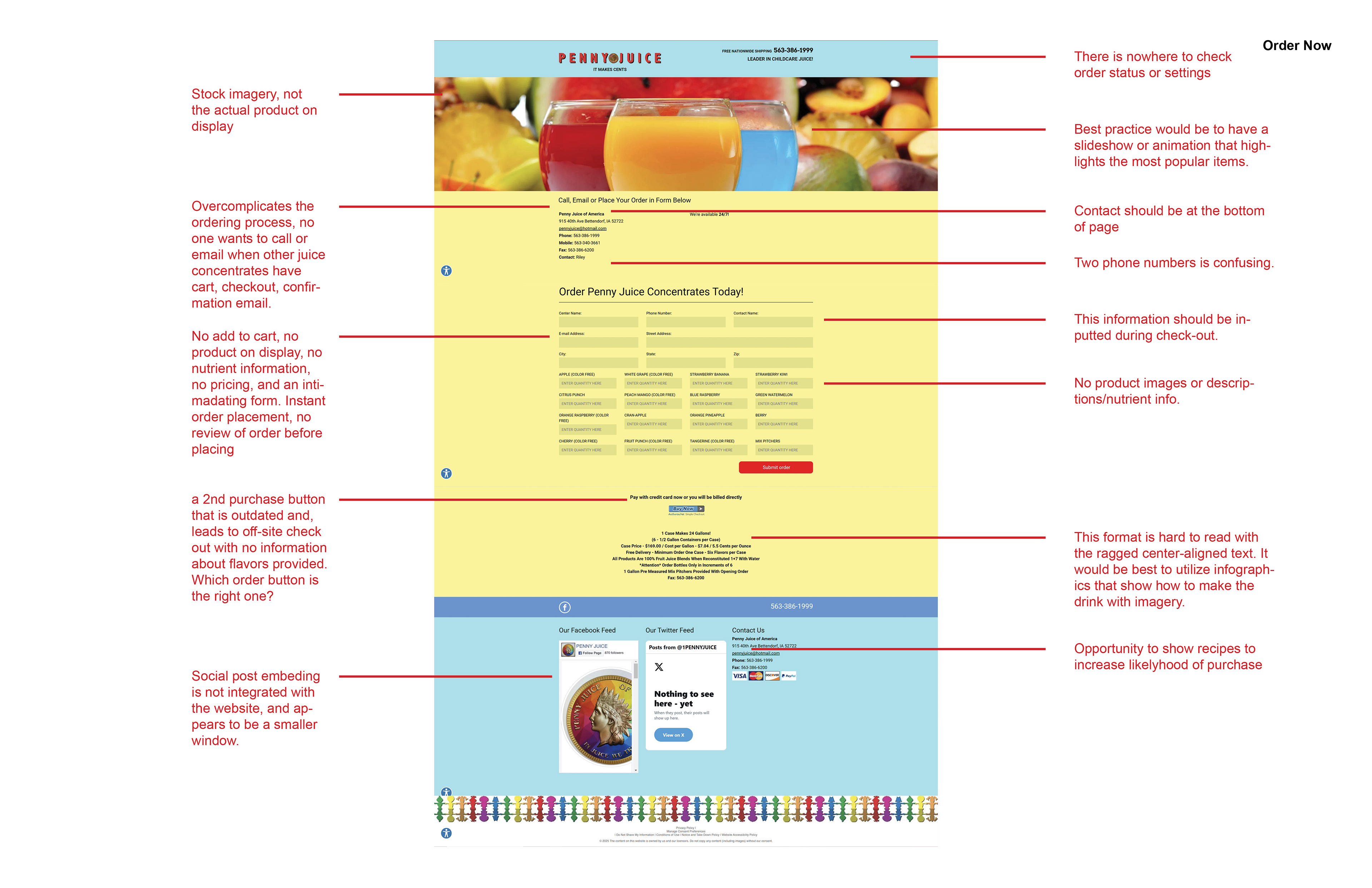
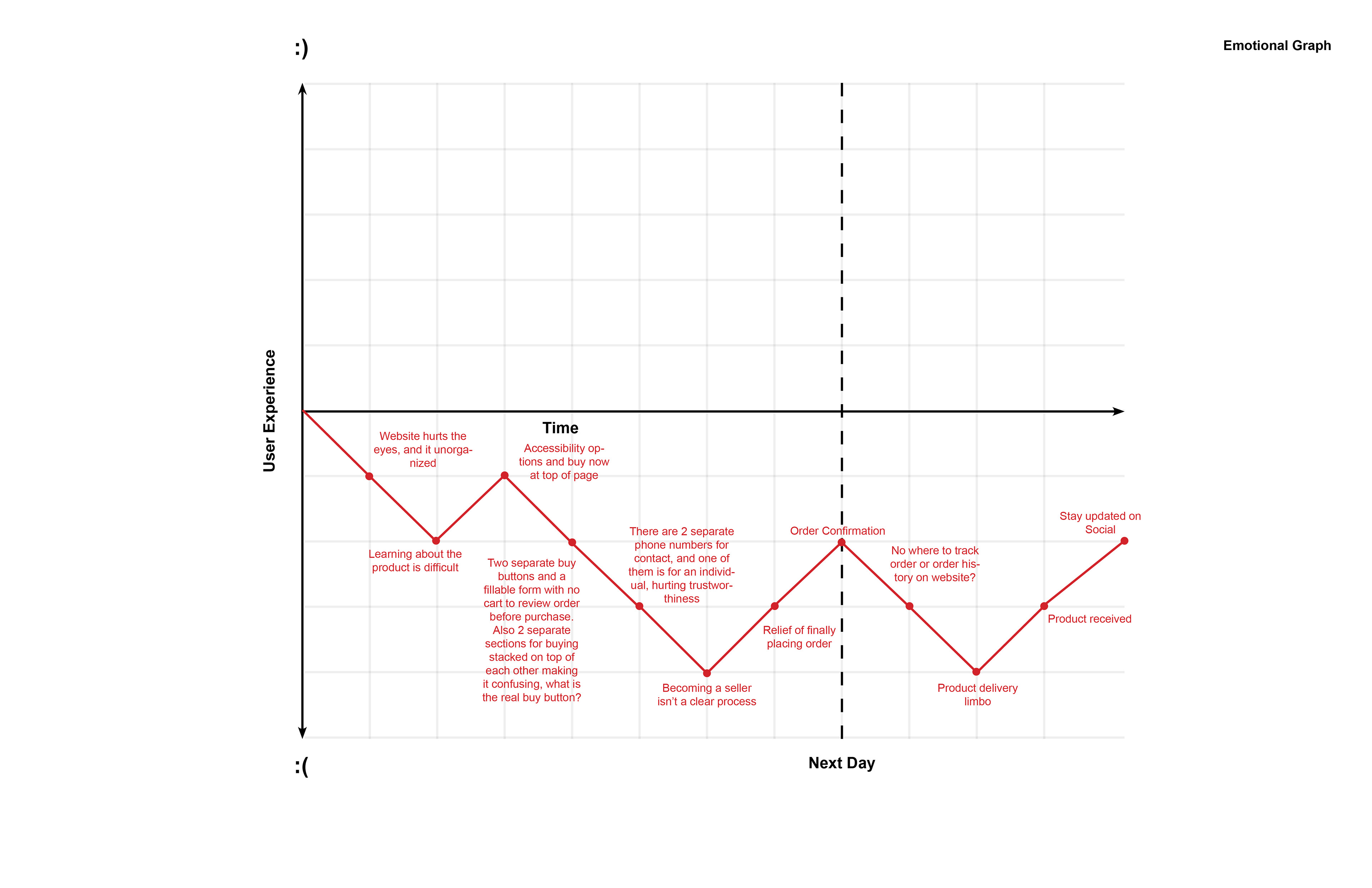
Strategically design a cohesive and memorable brand identity that captures youth, parents, and school faculty by providing feelings of child-friendliness, safety, and cost-efficiency. The current Penny Juice website suffers from a feeling of clunkiness, non-intuitive navigation, and outdated design practices, which hurt the user experience. These factors impact credibility and sales. The current brand identity is not memorable, so reinforcing a strong brand identity will also increase awareness and recognizability.
View the current Penny Juice website at www.pennyjuice.com/
Goals
1) Increase Penny Juice sales
2) Improve the User Interface and User Experience
3) Increase Brand Recognition and Credibility
2) Improve the User Interface and User Experience
3) Increase Brand Recognition and Credibility
Heuristic Markup

Wireframe Research
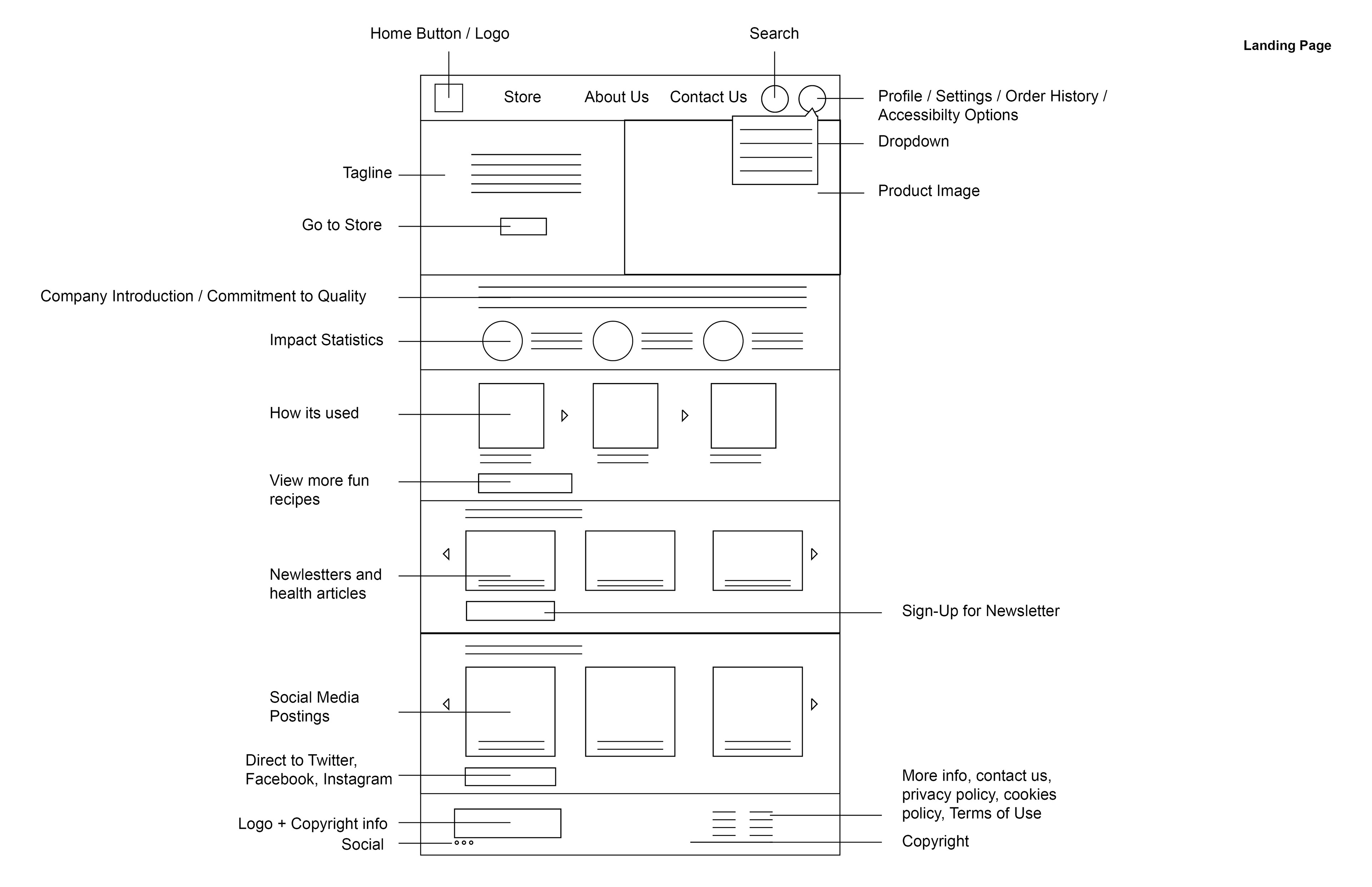


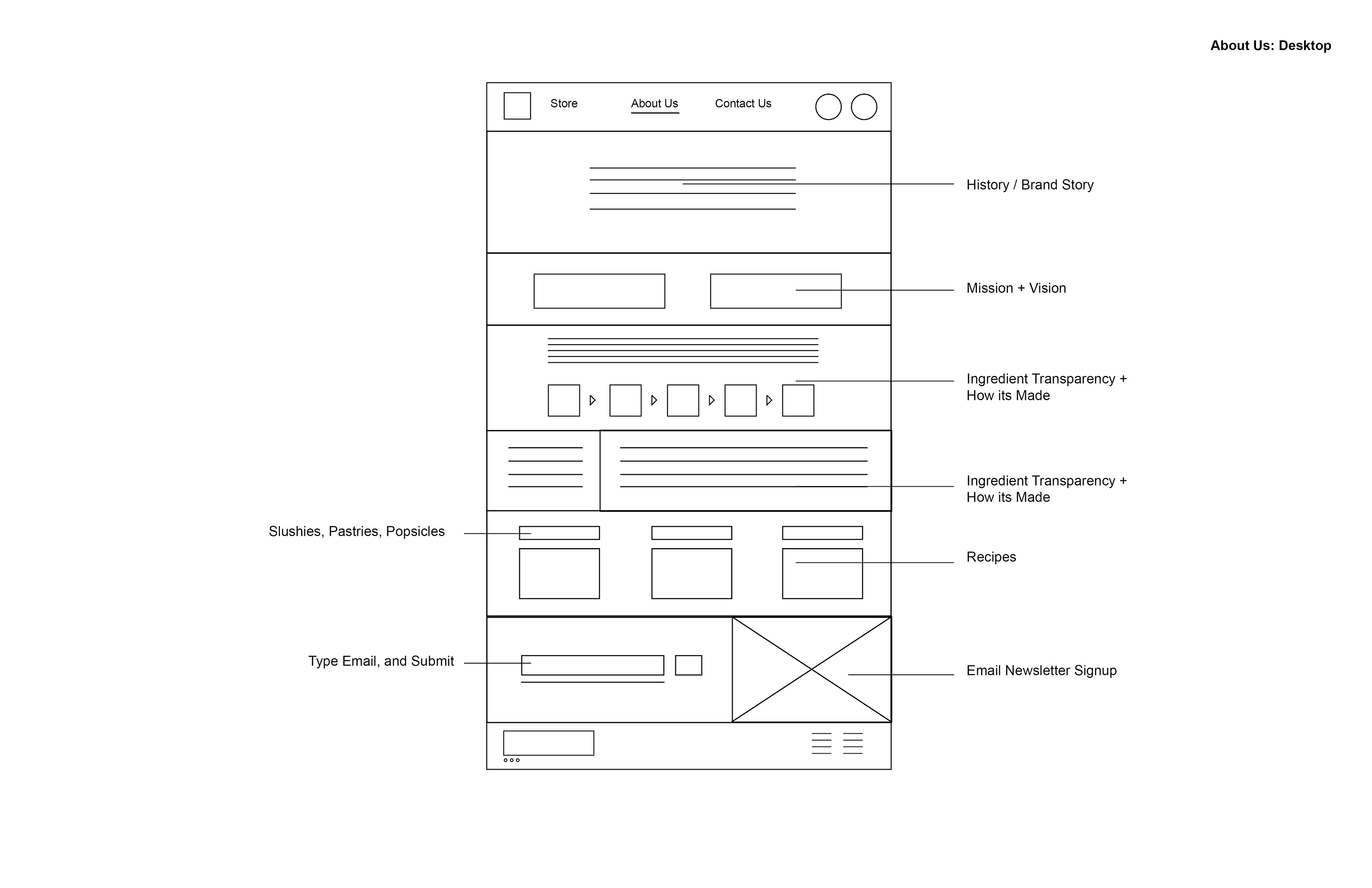
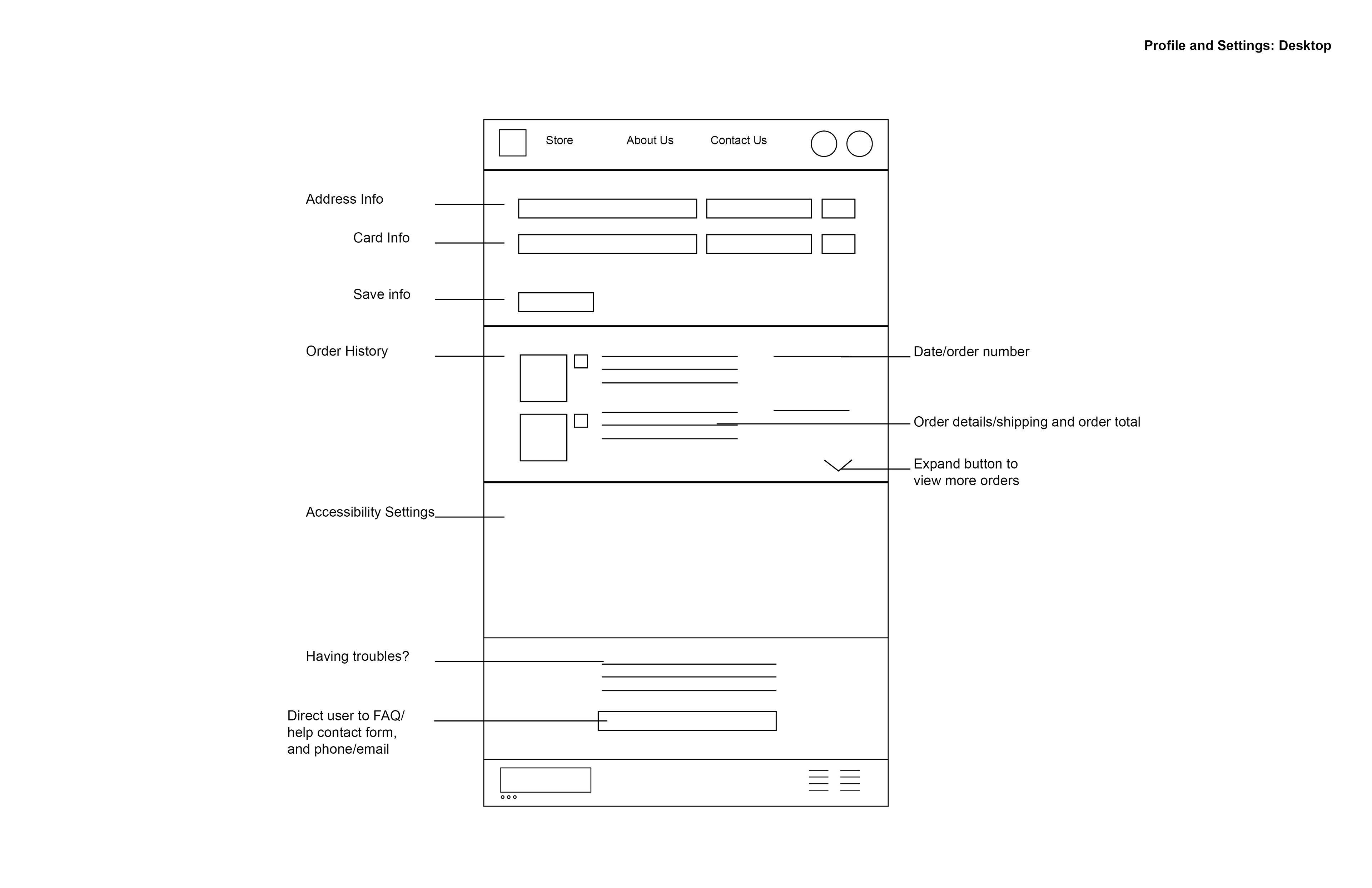
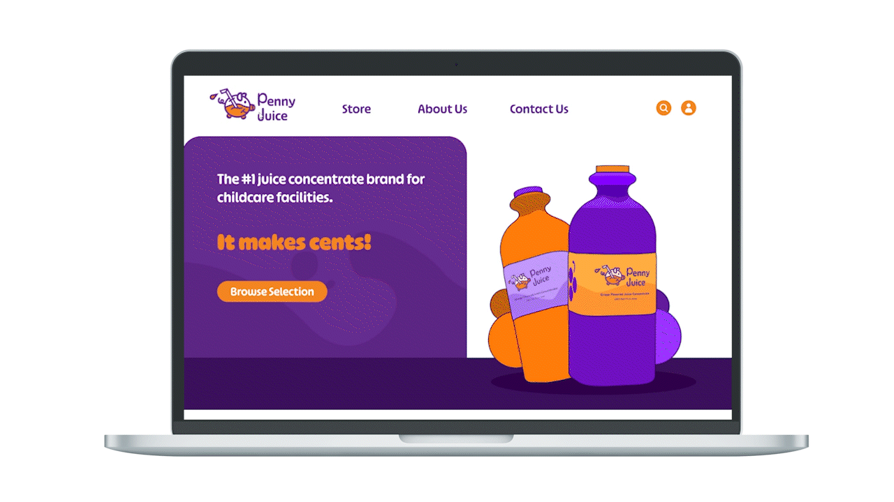
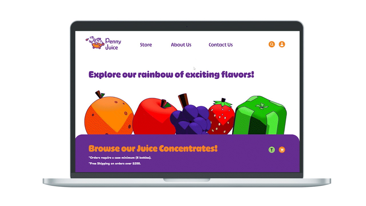
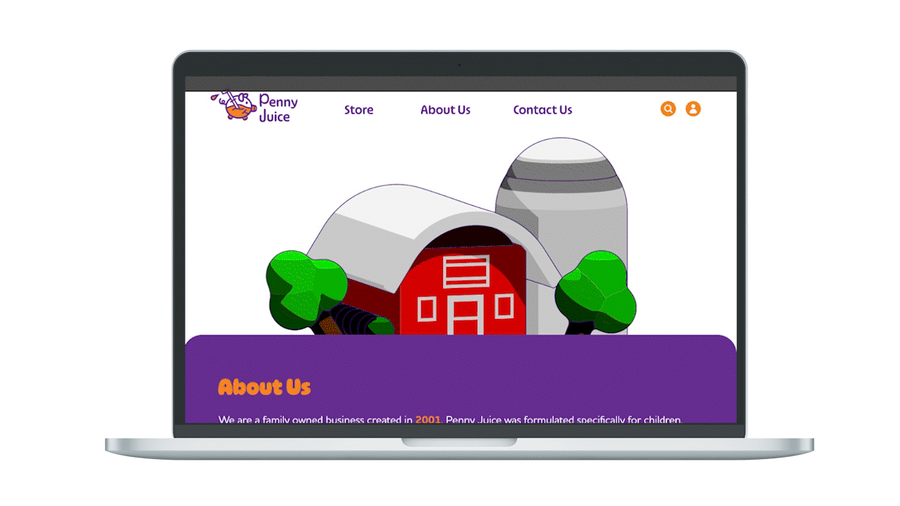
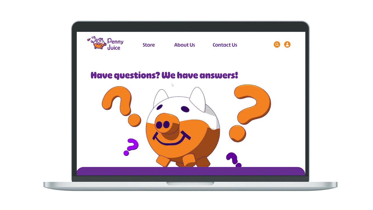
Desktop // Landing Page, Store, About Us, Contact Us

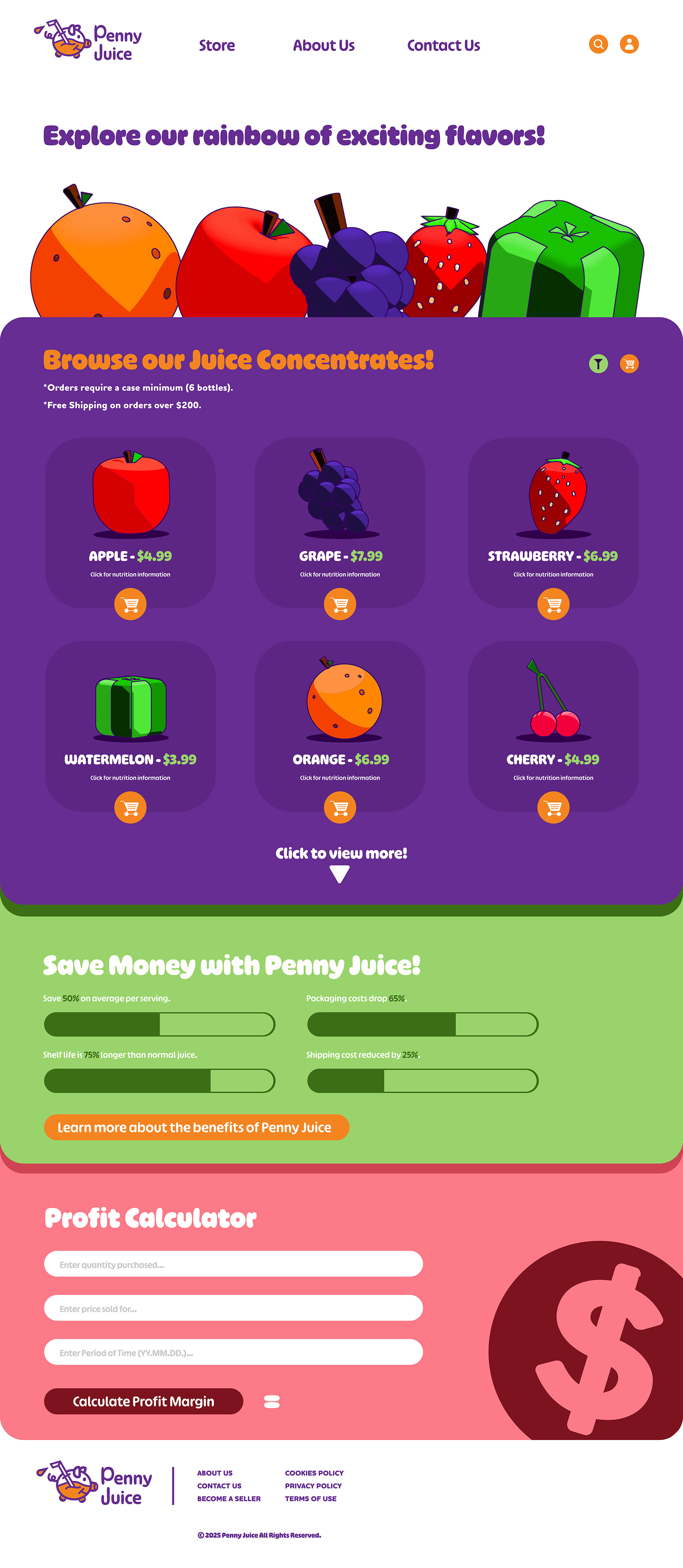
Home Page
Store Page
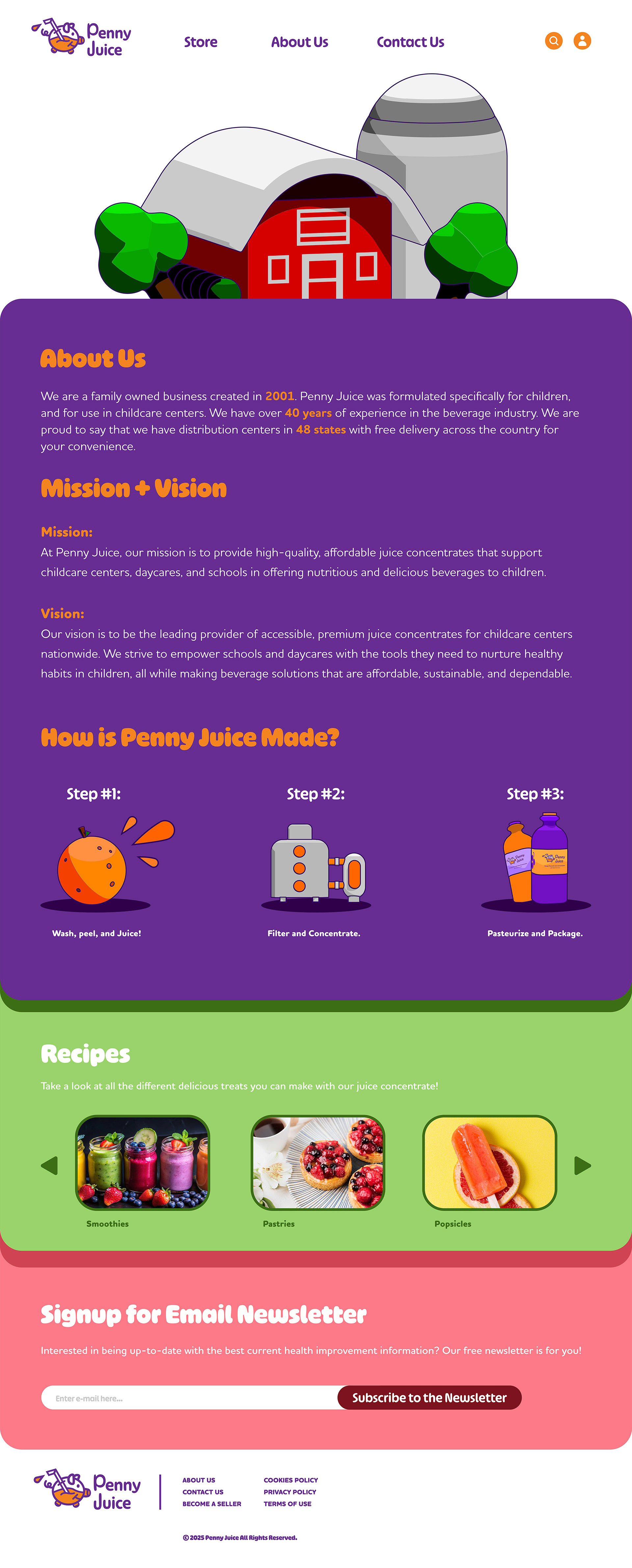
About Us Page
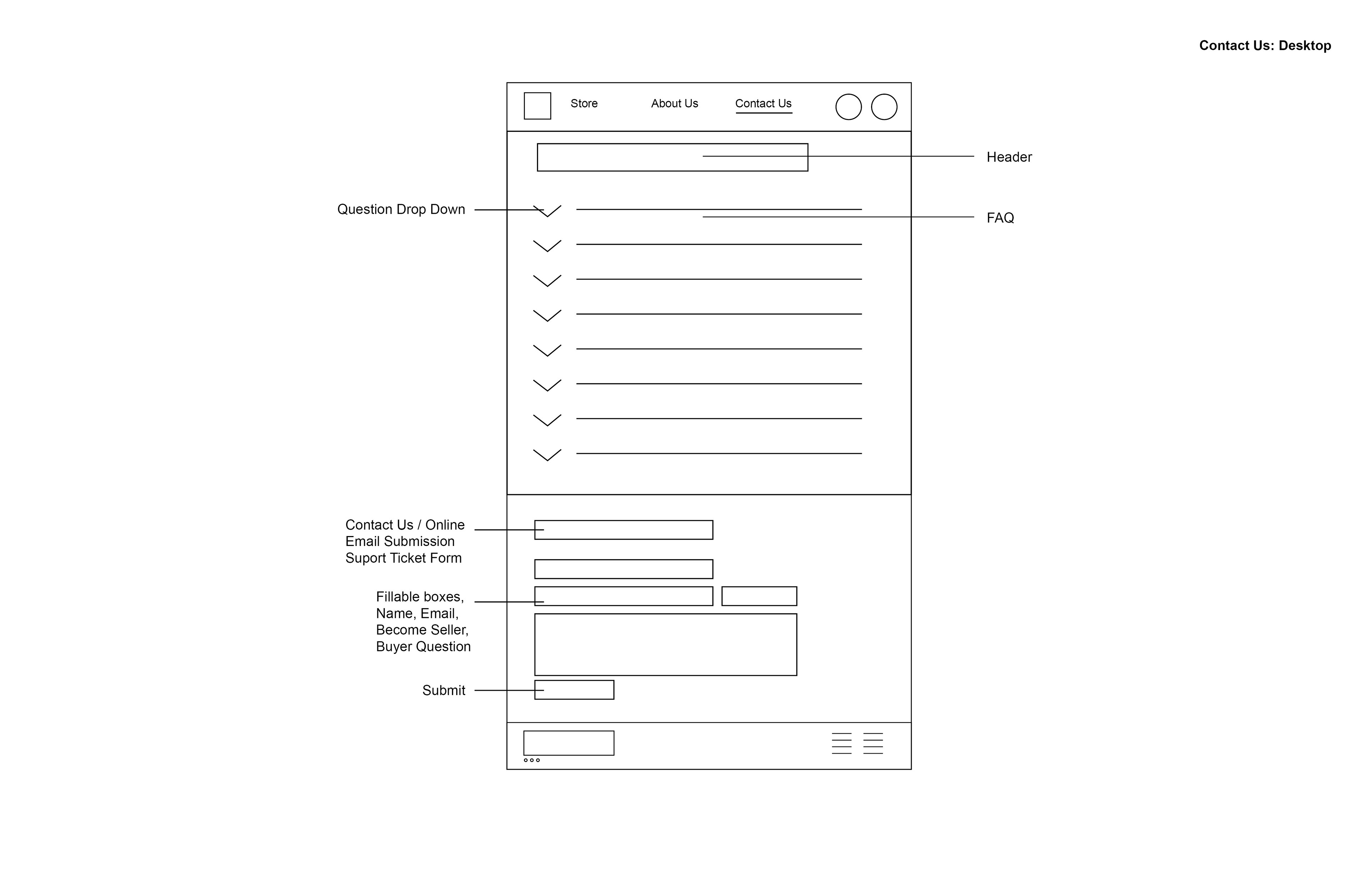
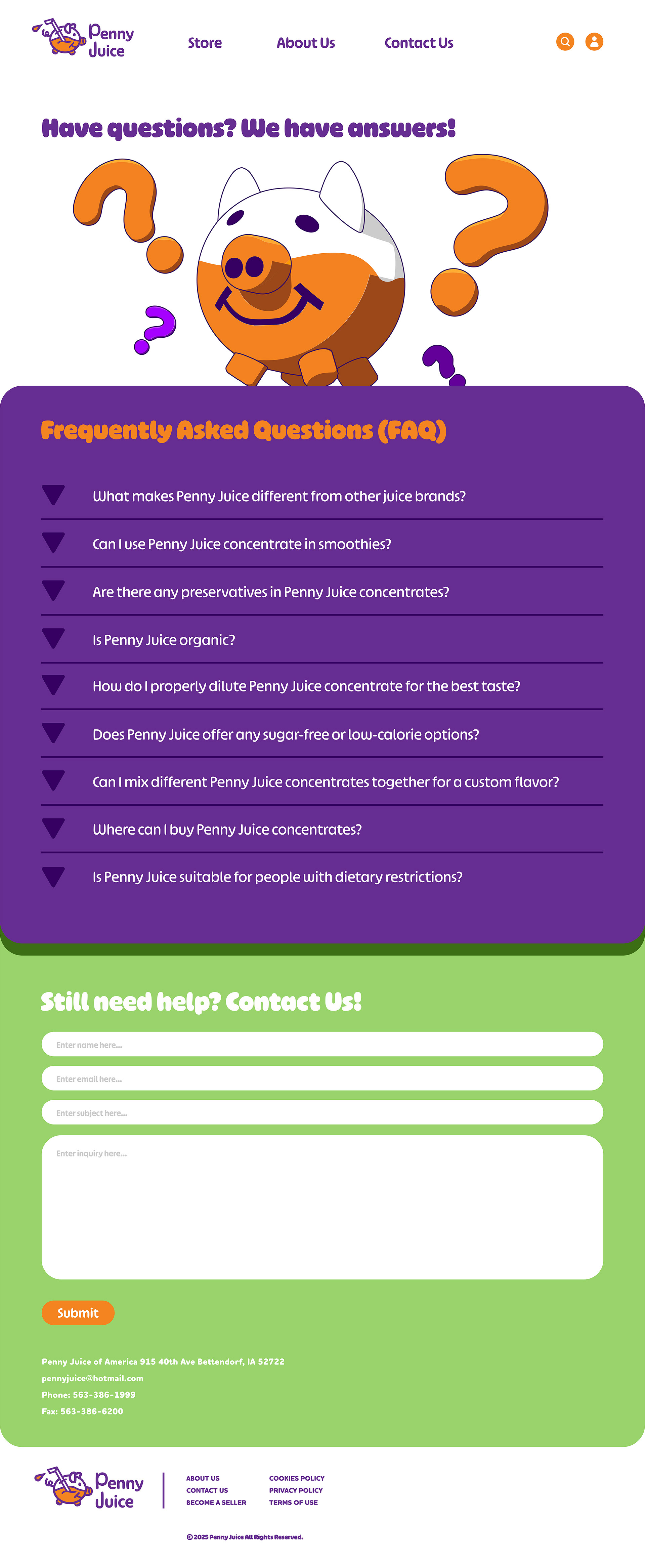
Support
Mobile // Landing Page, Store, About Us, Contact Us

View Mobile Version Here:
Conclusion
In conclusion, my brand identity and website redesign were a success in targeting the audience of parents, kids, and school faculty, maximizing product sales through intuitive new marketing ideas, and fixing key pain points users would encounter while using the previous website. If I had to change anything during this process, I would have spent more time on iconography, the layout and aesthetics of the, About Us page, and done a totally different label design for the bottles.