Aftershock History
Aftershock is California’s largest Hard Rock music festival, located in its capital, Sacramento. Running its 12th consecutive year, Aftershock is known for its extensive and diverse lineup, multiple stages with big headliners, large attendance, and sense of community, drawing all walks of life internationally.
Problem Statement
Strategically design a cohesive and memorable brand identity that captures the energy and experience of the Aftershock Music Festival, while advancing the brand’s visual language to capture the attention of likely and unlikely audiences, with the main goal of gaining ticket sales. Other important goals include selling merchandise, providing information, and improving the user experience through intuitive user interfaces.
Goals
1. Improve and develop a new brand identity.
2. Create collateral for digital, print, and environmental.
3. Immerse the audience in the Hard Rock genre.
2. Create collateral for digital, print, and environmental.
3. Immerse the audience in the Hard Rock genre.
Triads
After creating a word mind map for Aftershock, I picked the words that stood out most to me for visual exploration in the conceptual phase.

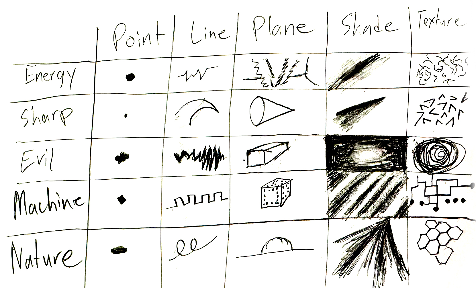
Visual Matrix
The visual matrix served as a guide for the quality of elements through point, line, plane, shade, and texture.
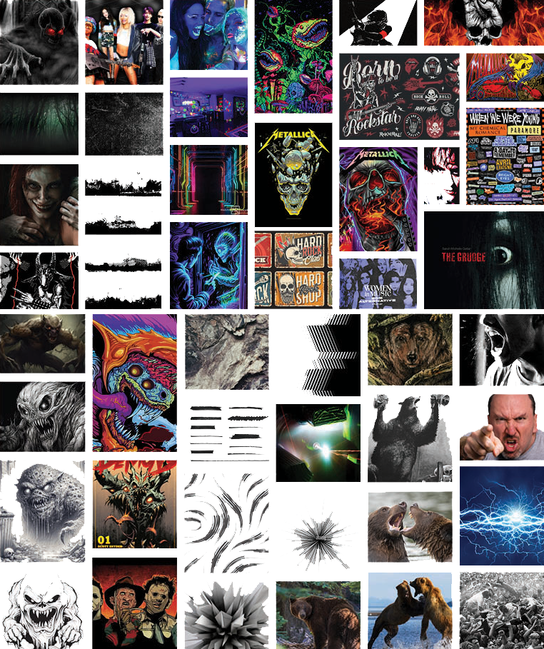
Mood Board
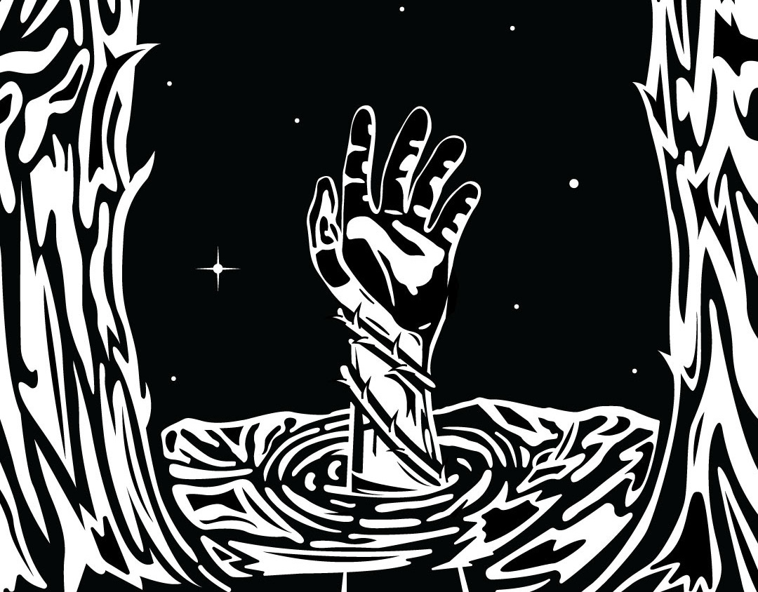
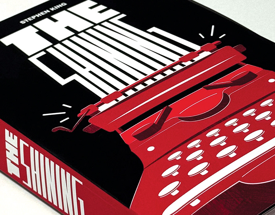
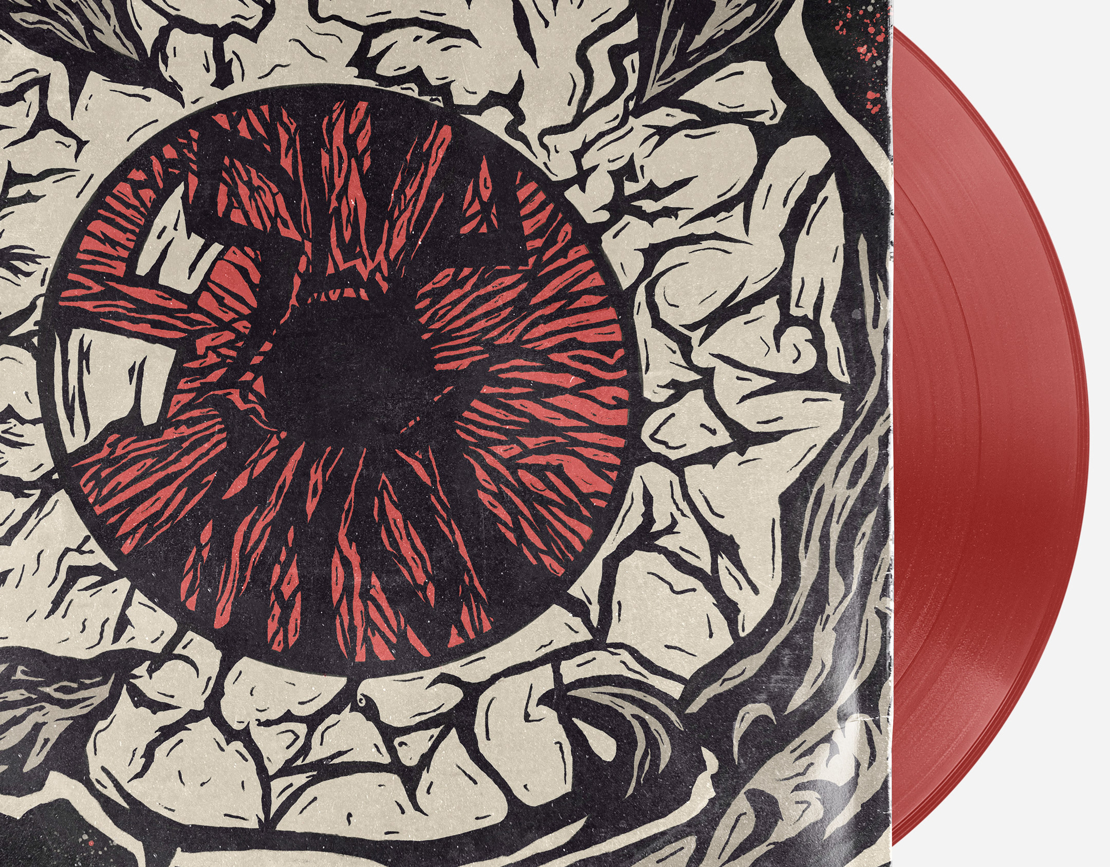
Researching other music events, bands, movies, Halloween/horror themes, and artstyles, I complied these images for visual direction and inspiration.
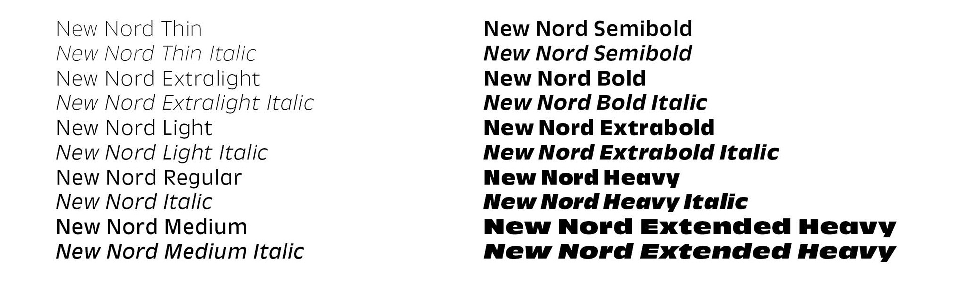
Font Selection: New Nord
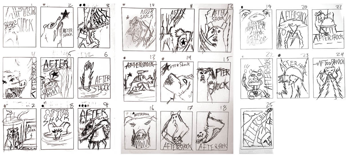
Thumbnail Sketches
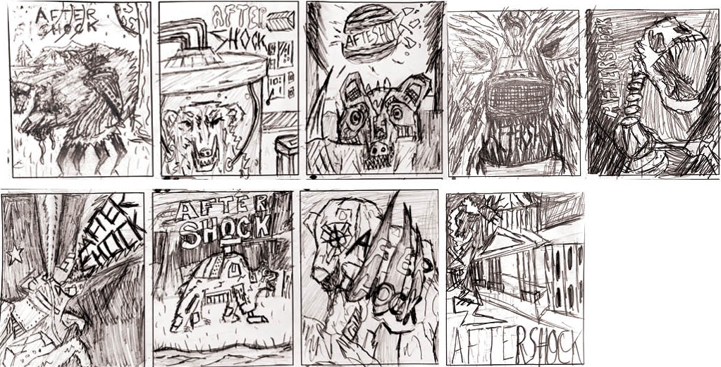
Refined Thumbnails
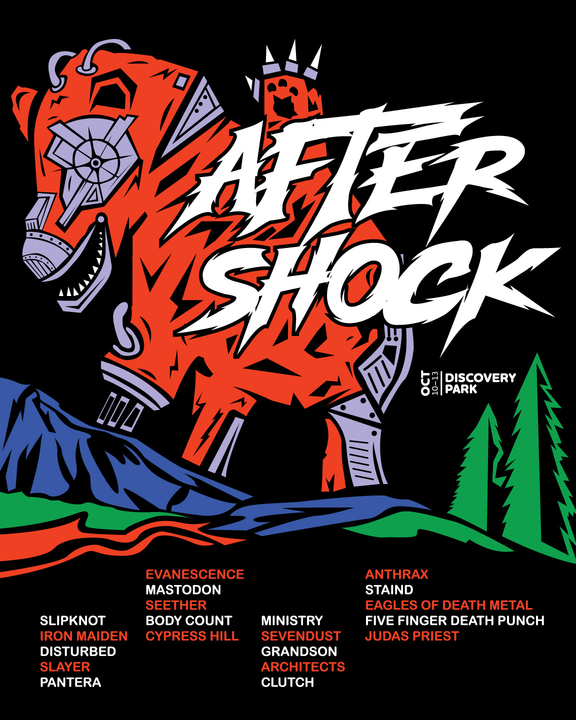
Digital Sketch Solution
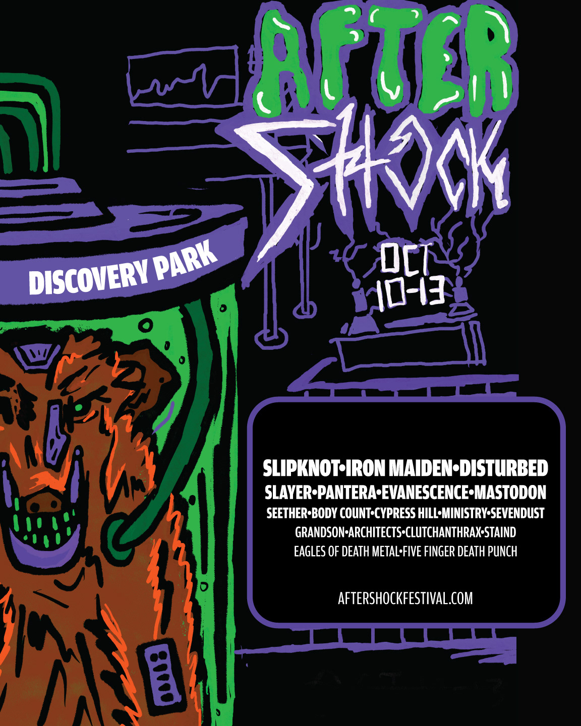
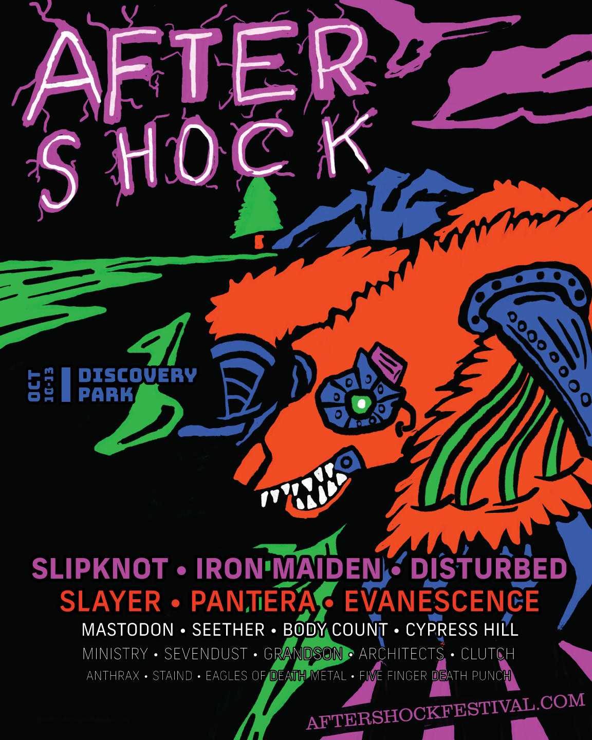
Advanced Digital Sketch Solutions
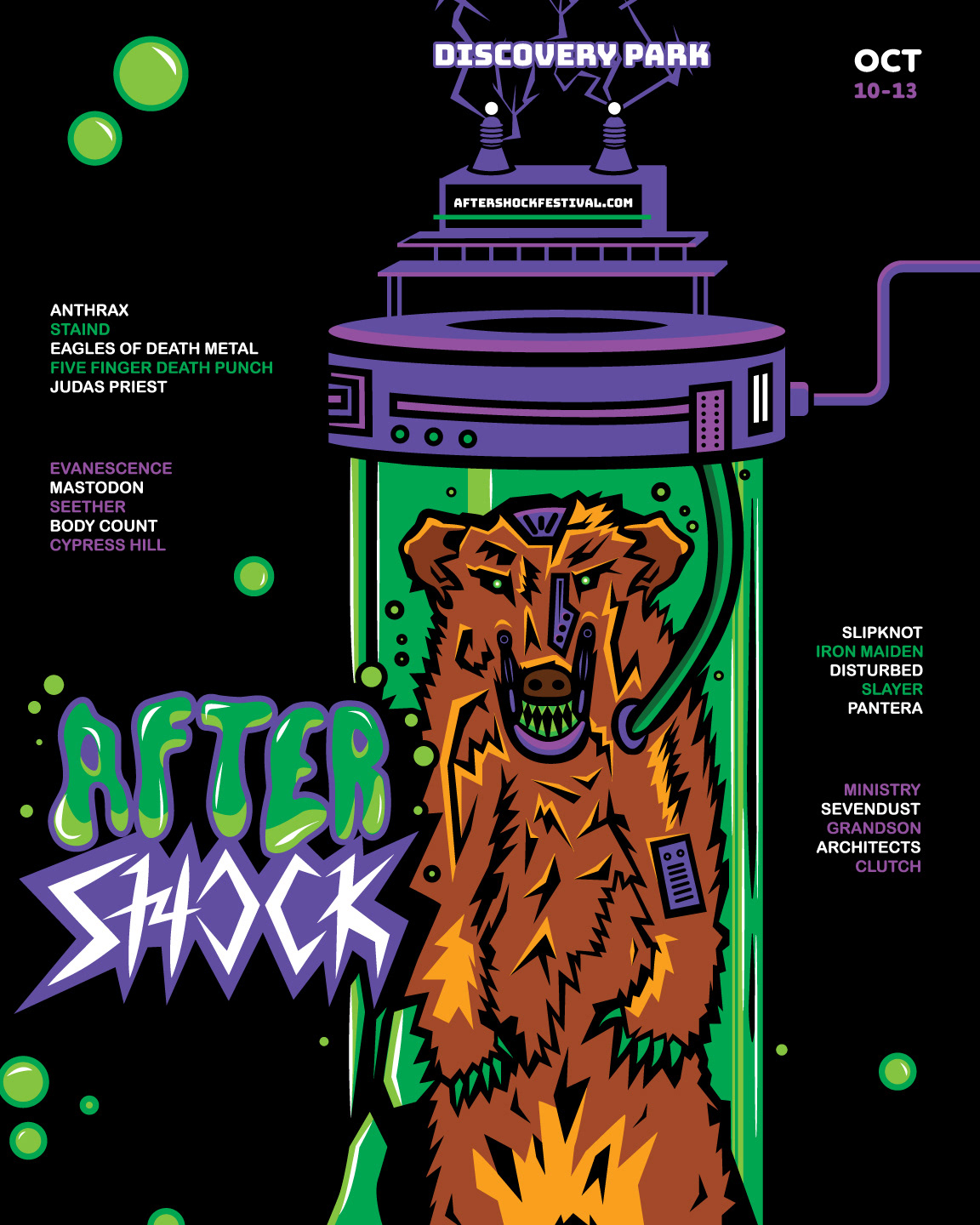
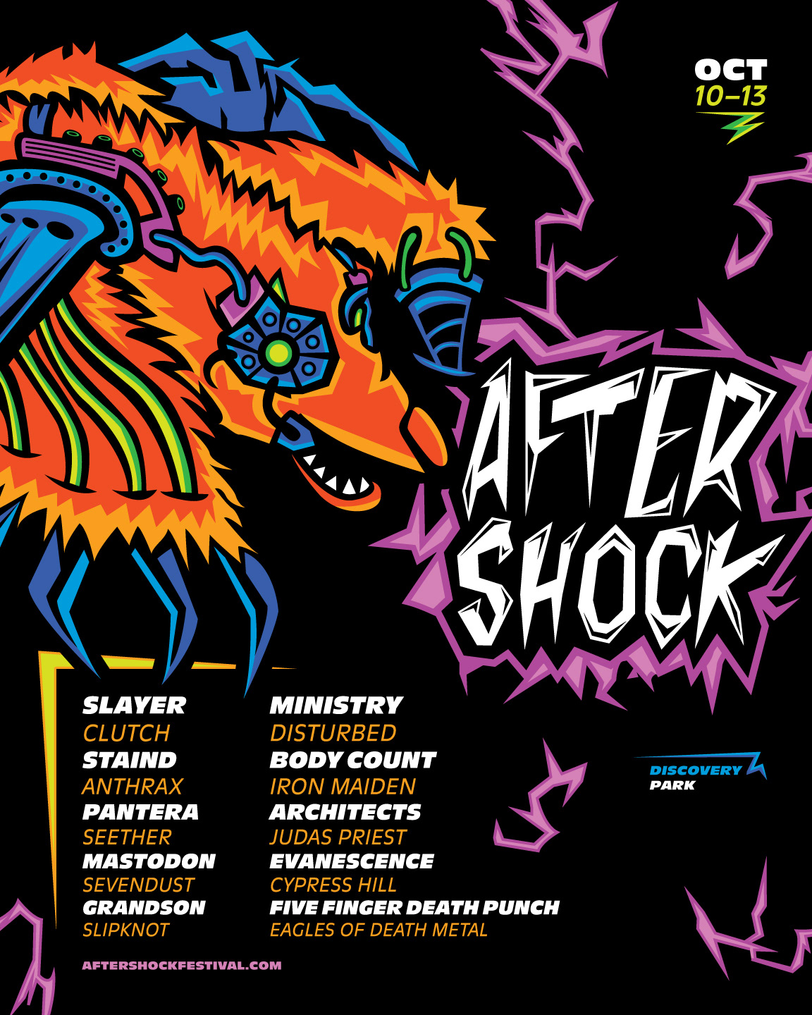
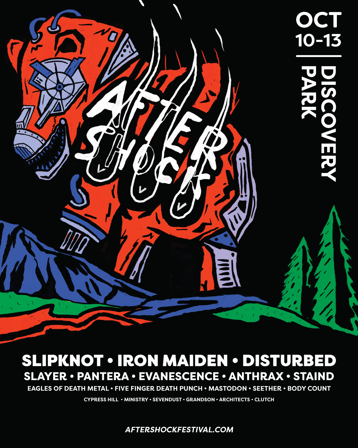
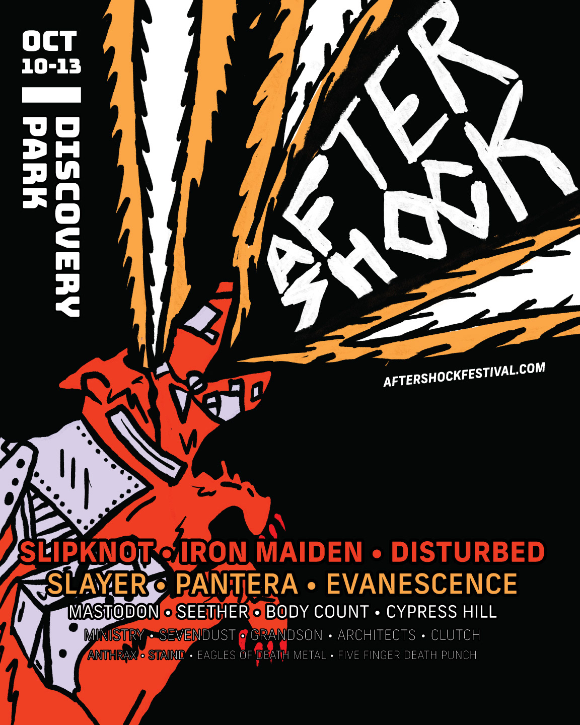
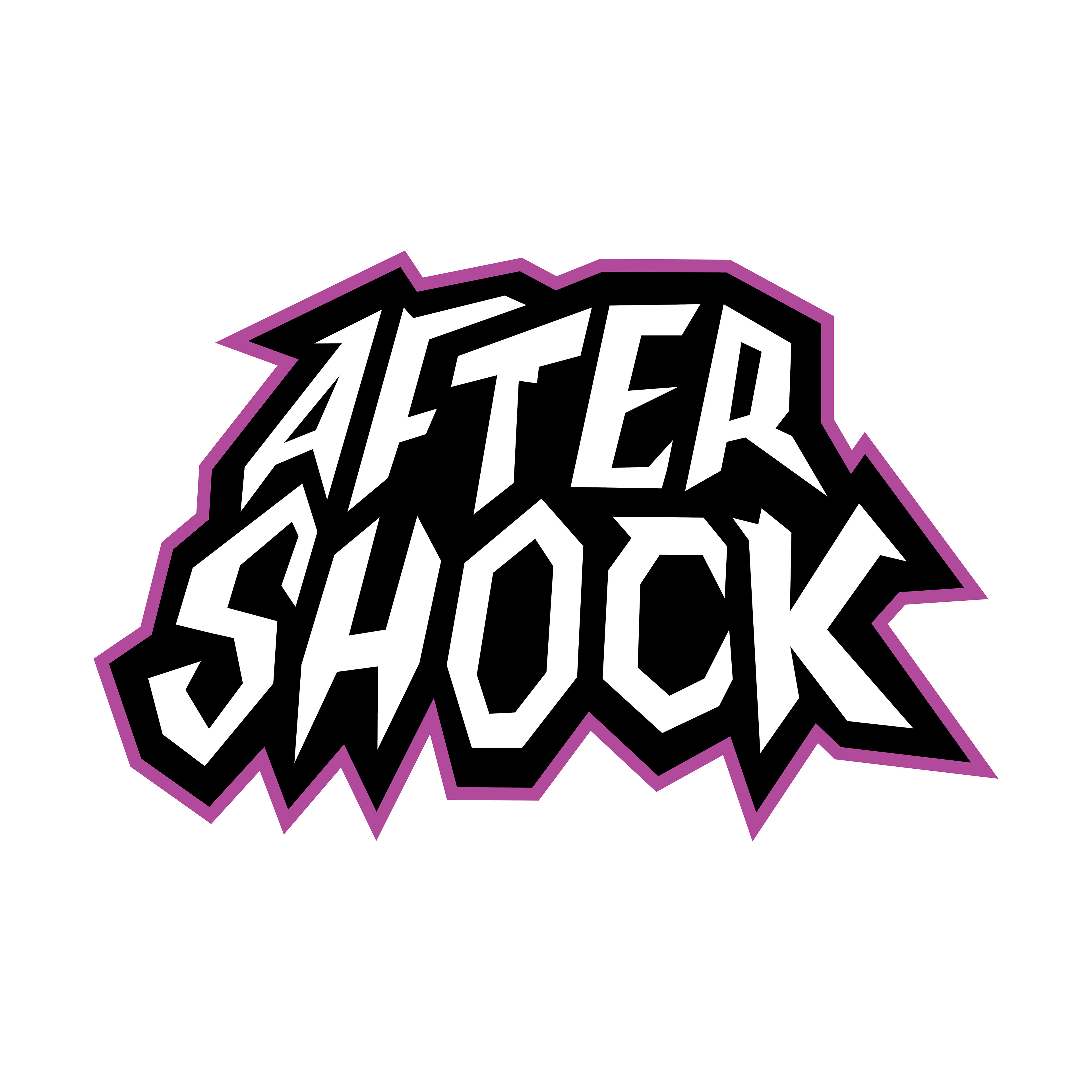
Final Solution
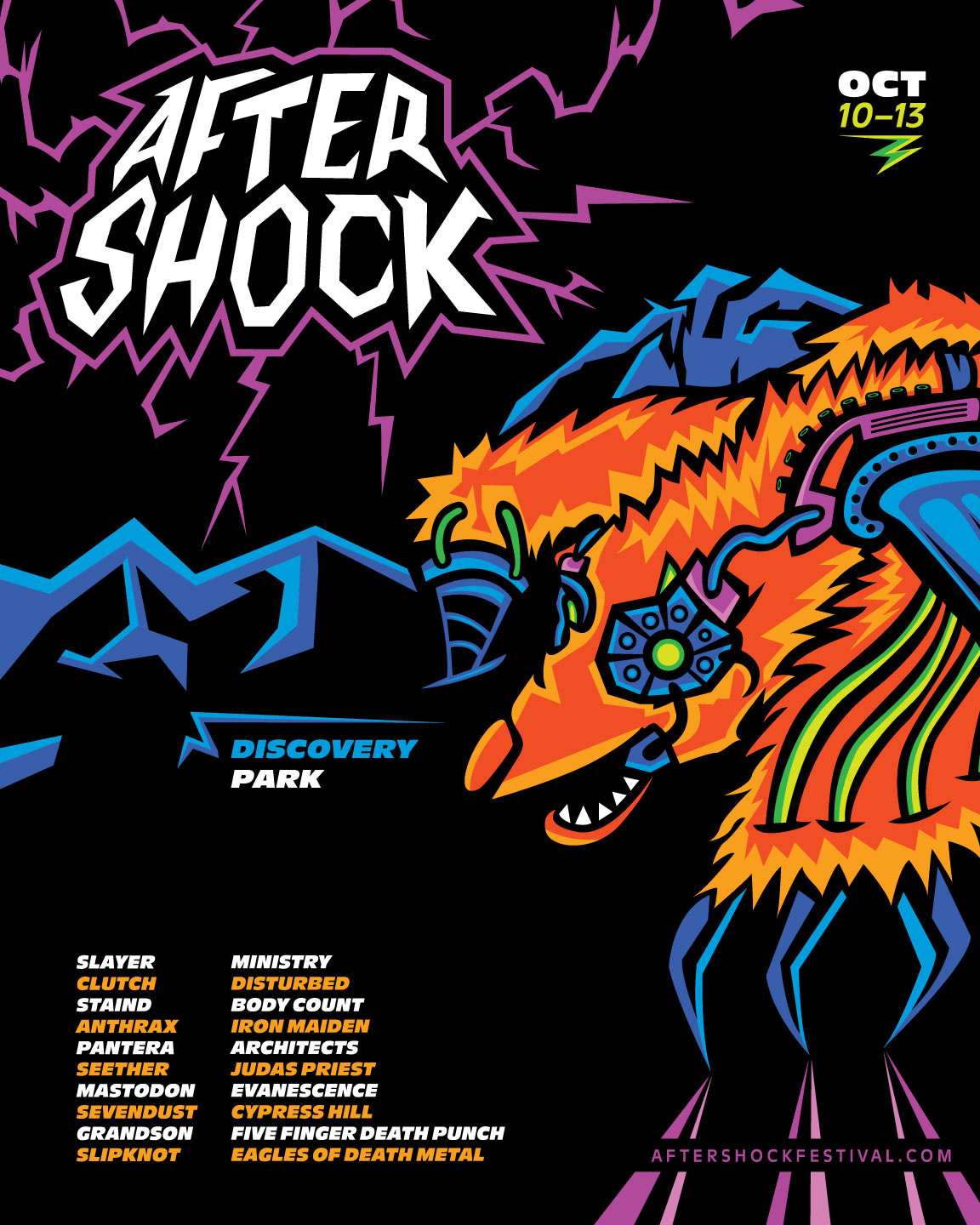
Brand Logo
TOUCHPOINT #1: AWARENESS
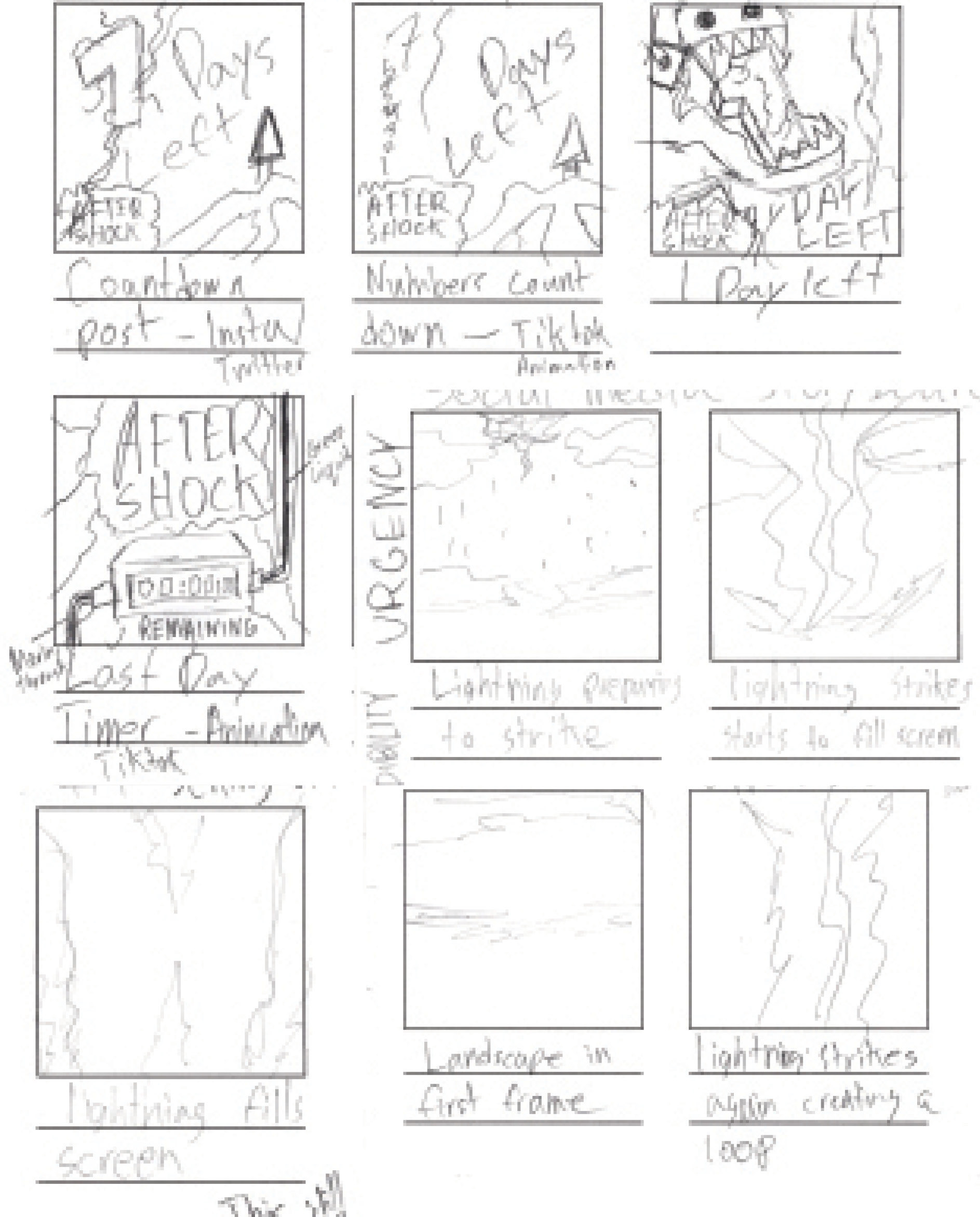
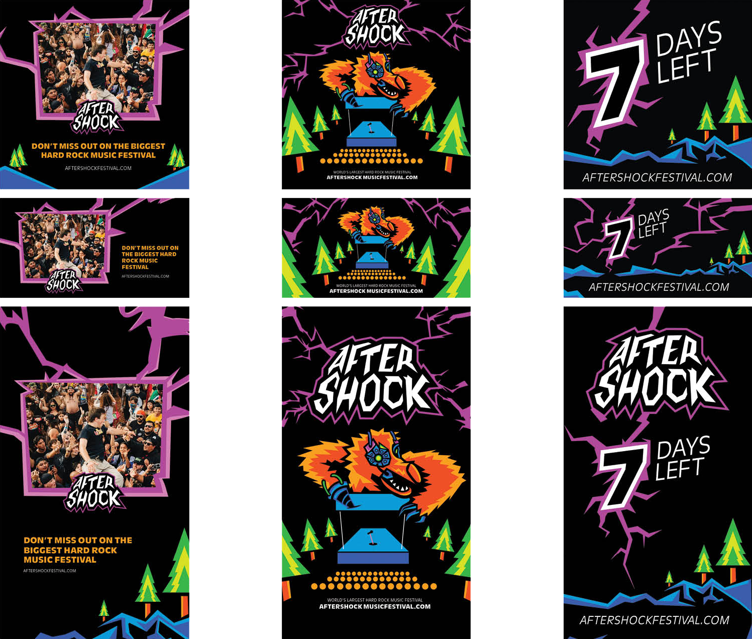
Social Media Campaign Storyboarding
Urgency, Experience, Validation/Credibility, Trivia
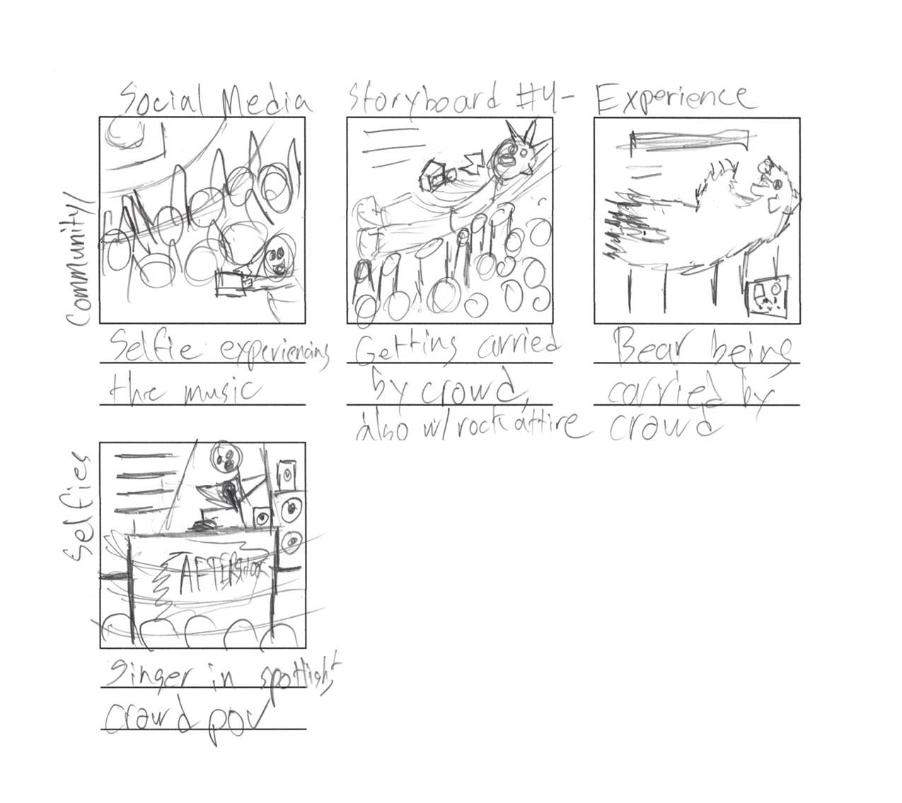
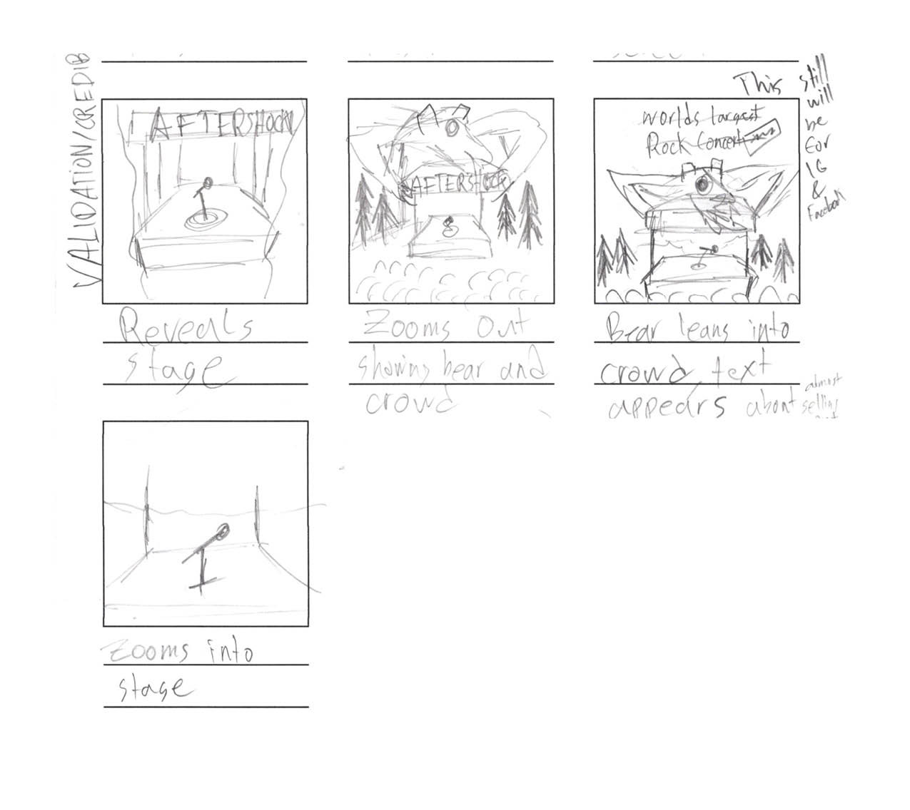
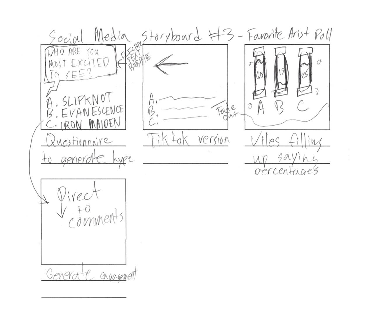

Experience, Validation/Credibility, Urgency
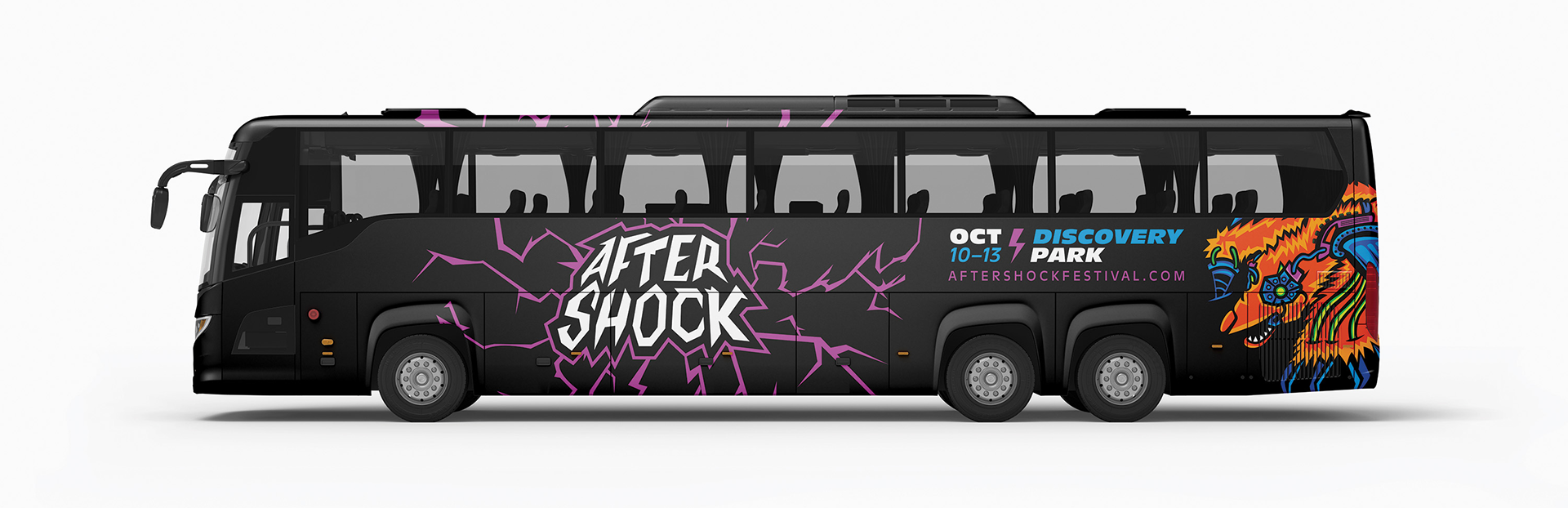
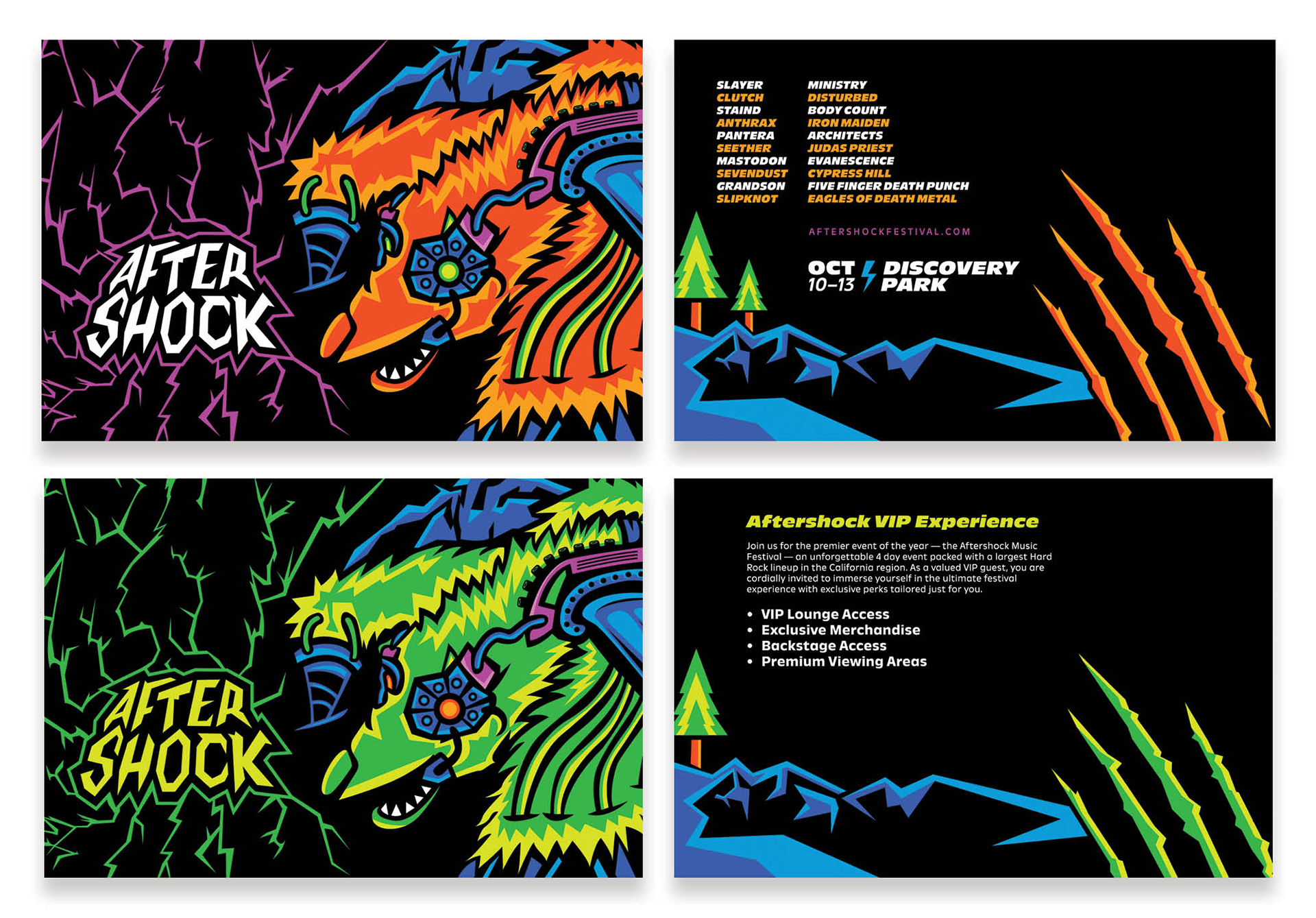
Bus Poster and Bus Wrap
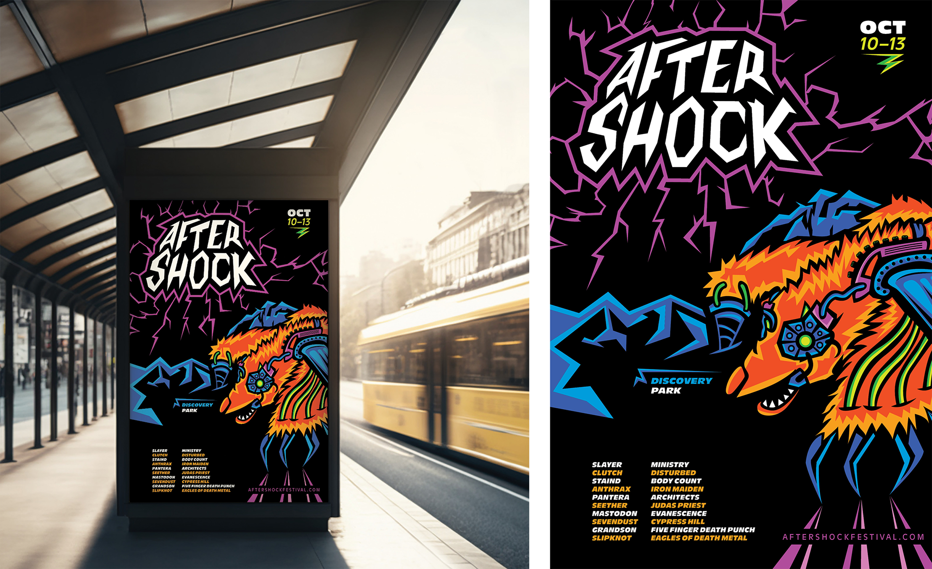
Billboard

Postcard
TOUCHPOINT #2: PLANNING
Wireframing
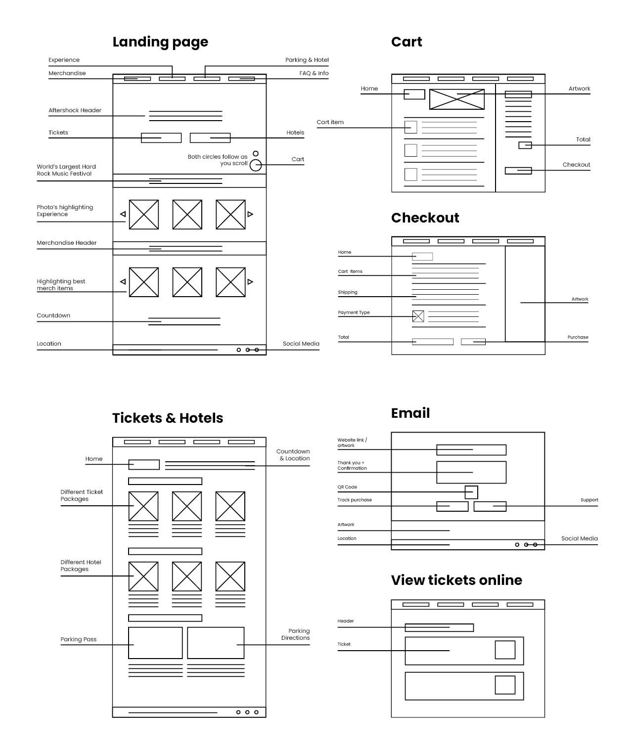
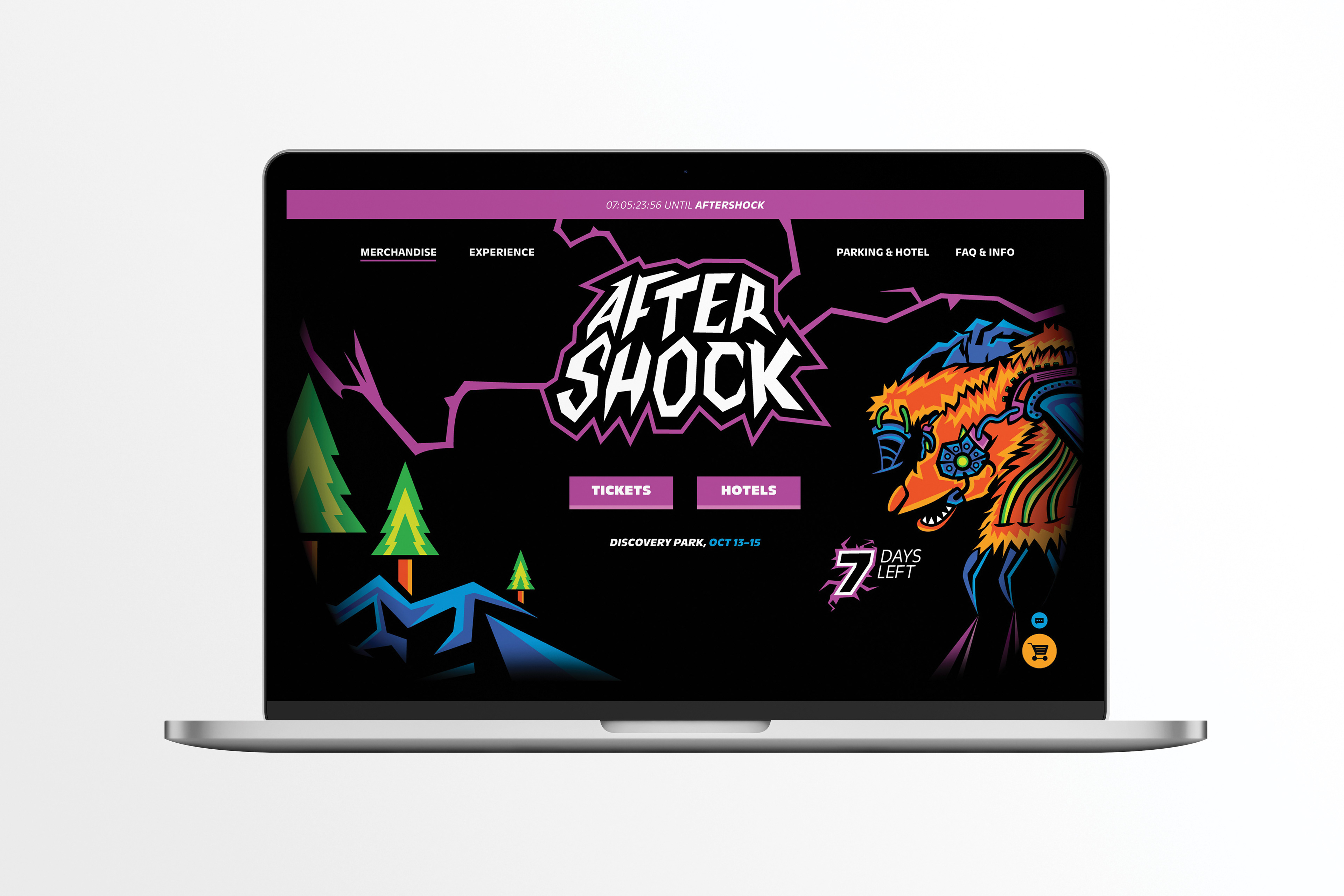
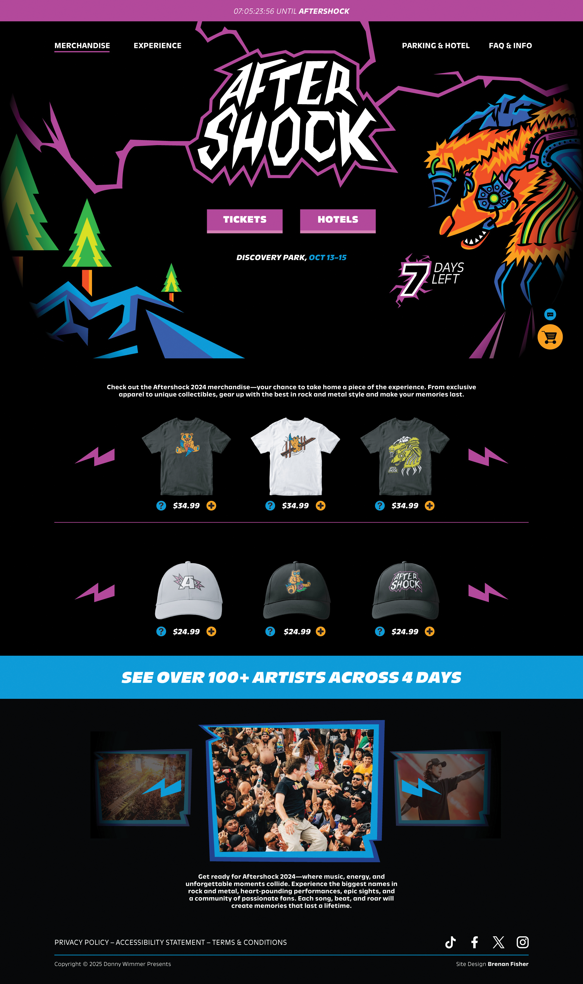
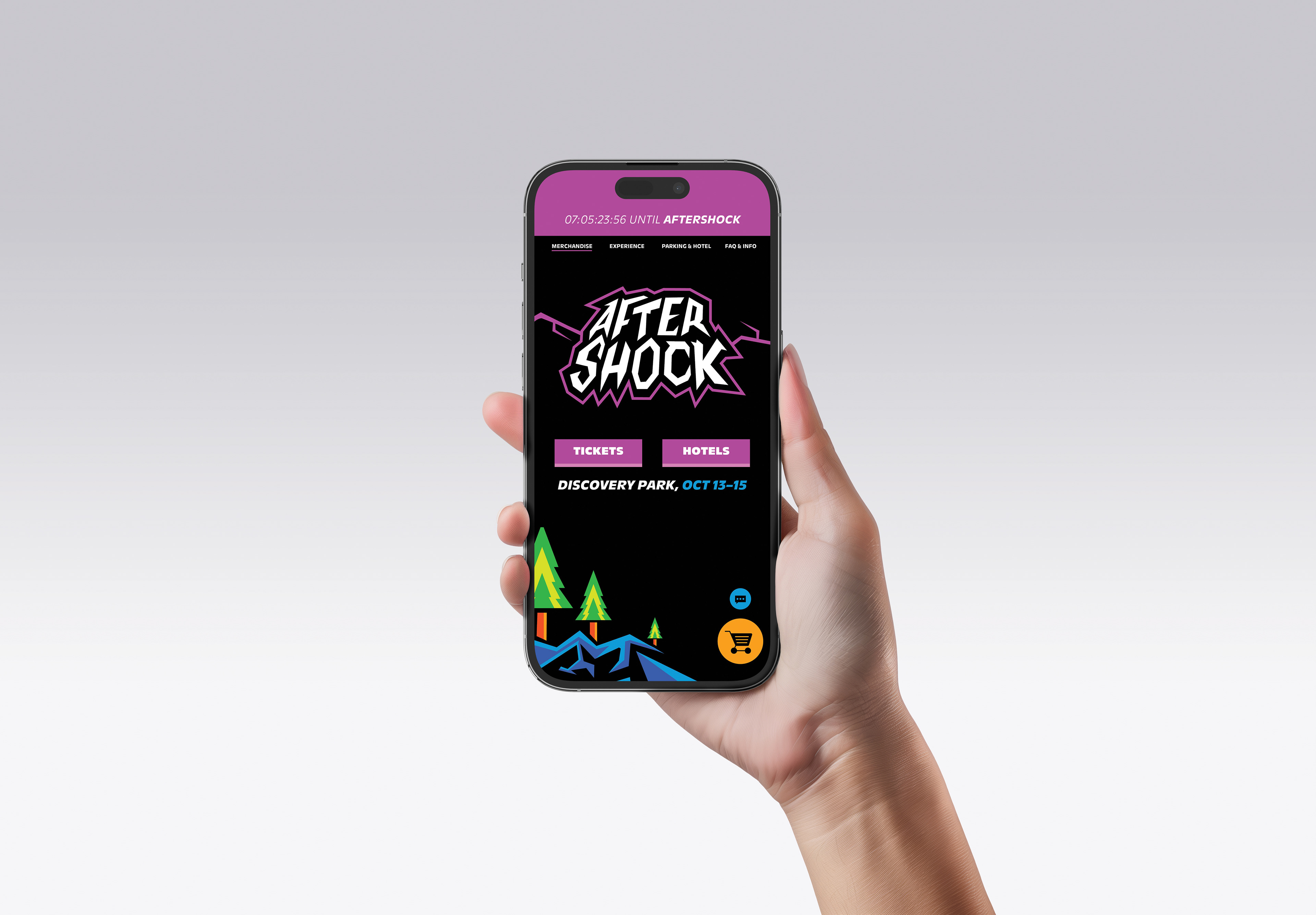
Landing Page
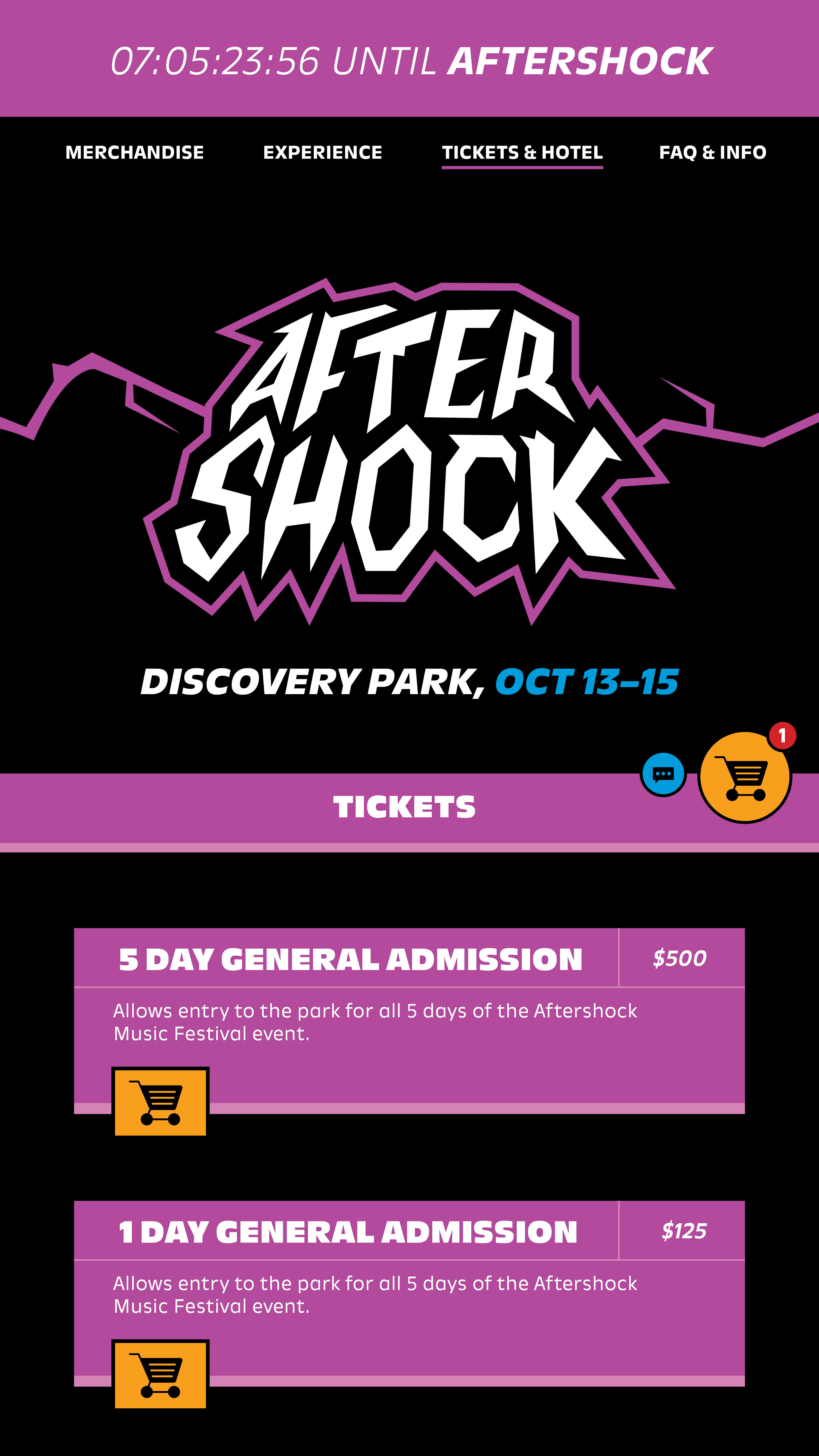
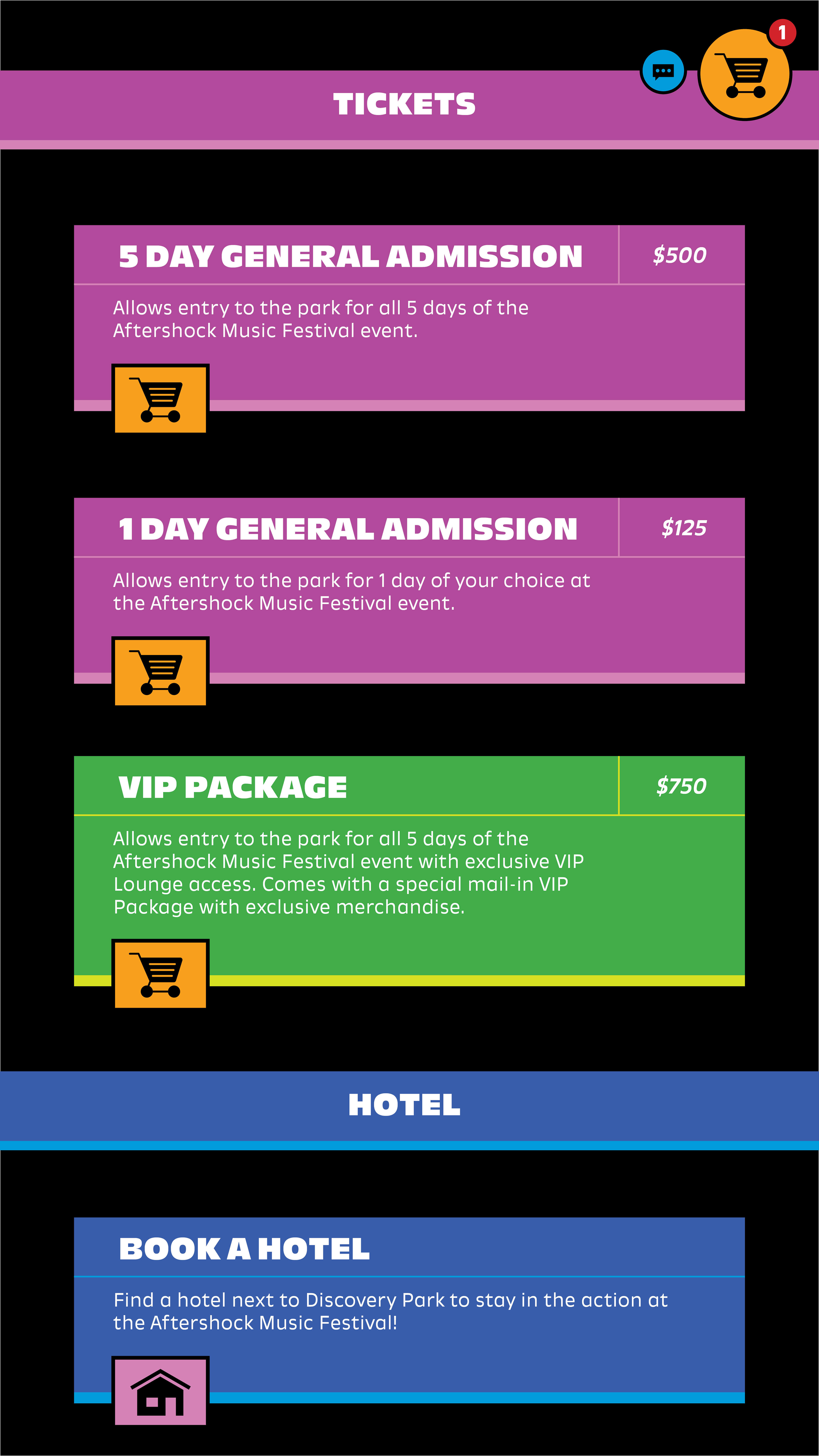
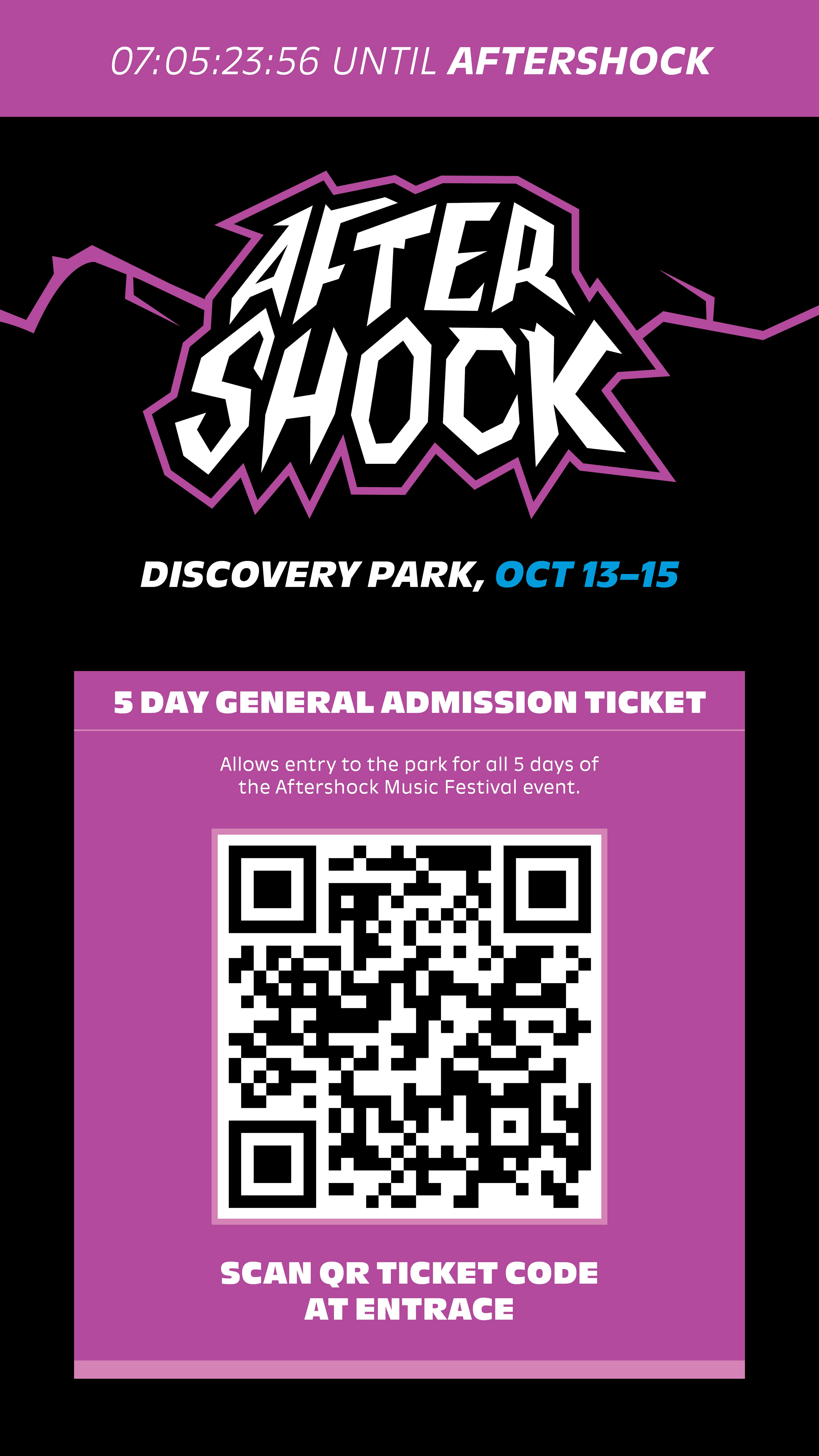
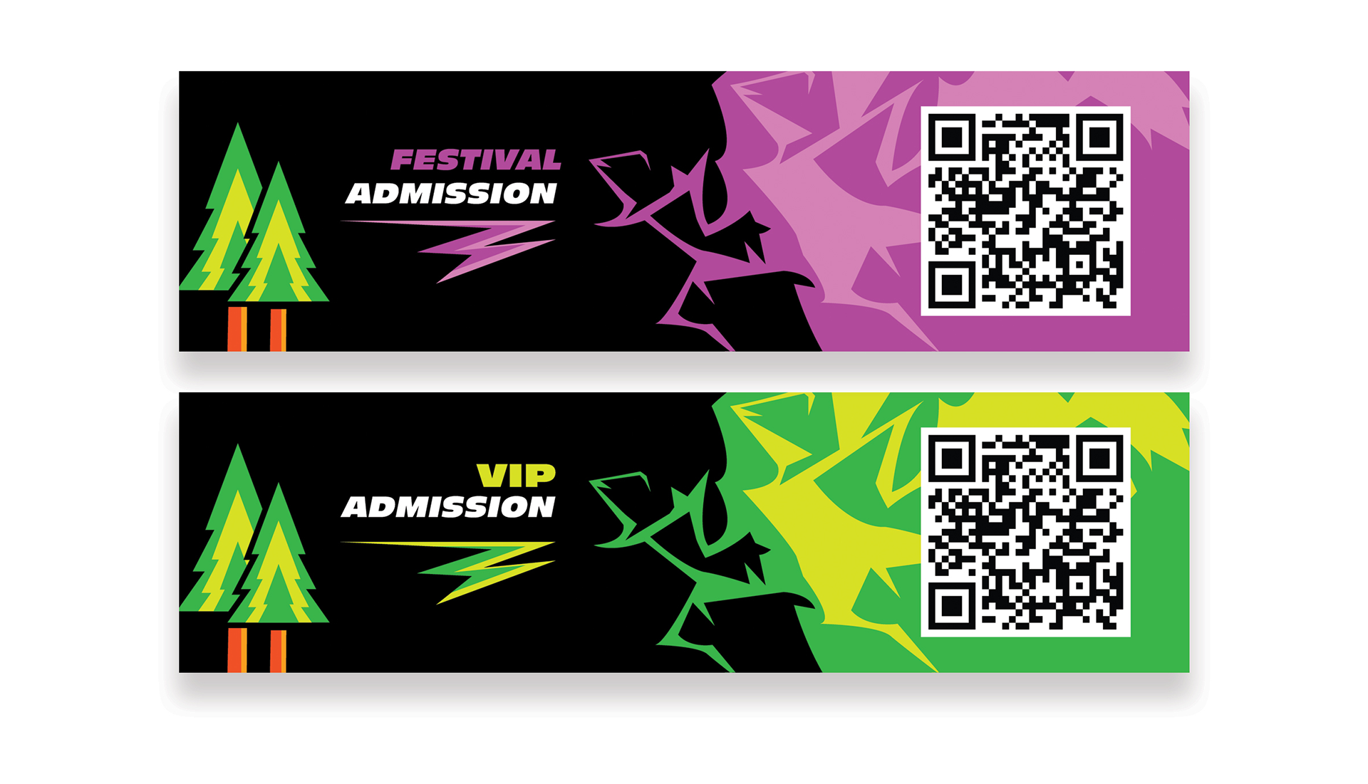
Tickets & Scheduling
TOUCHPOINT #3: WAITING
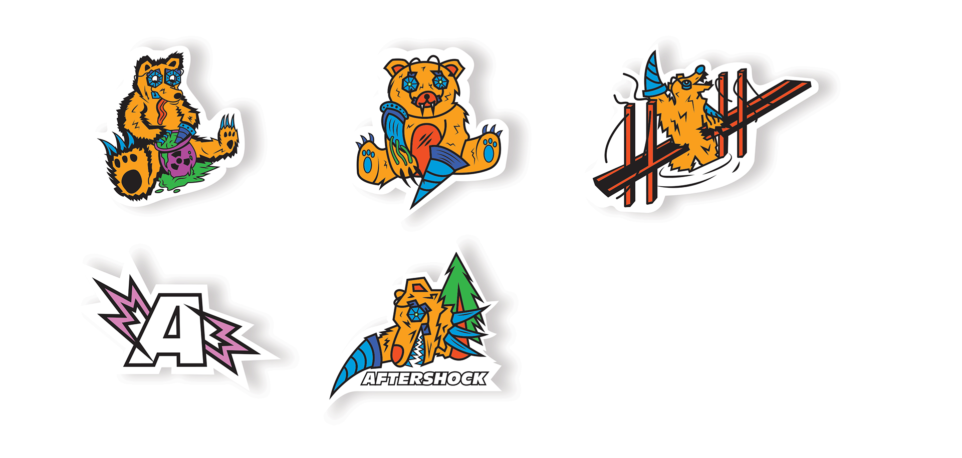
Stickers
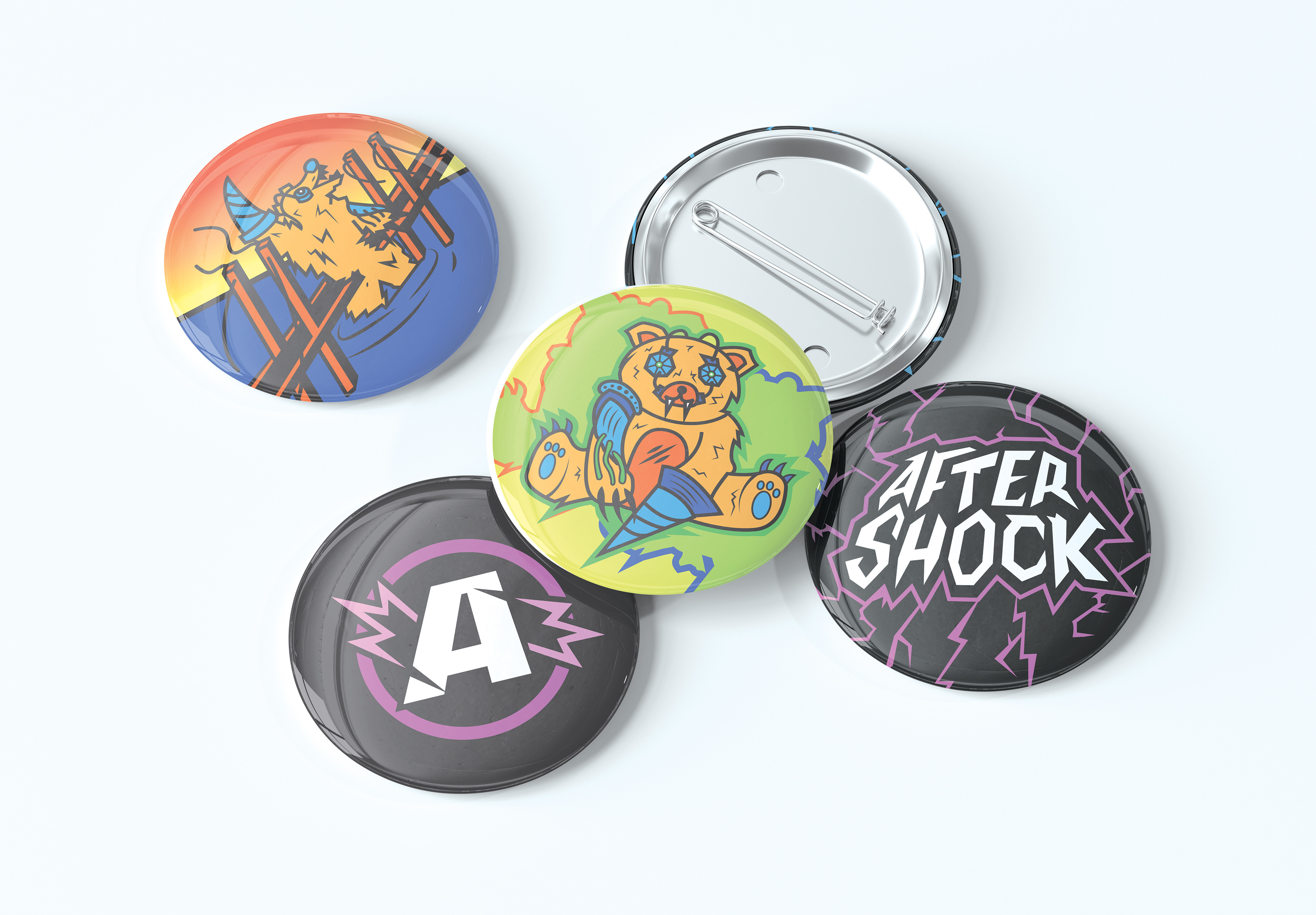
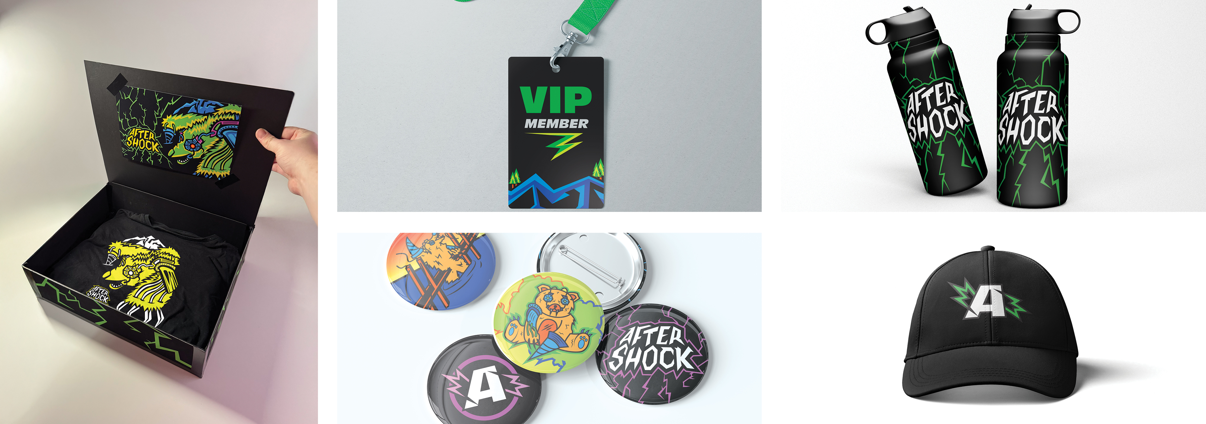
Buttons
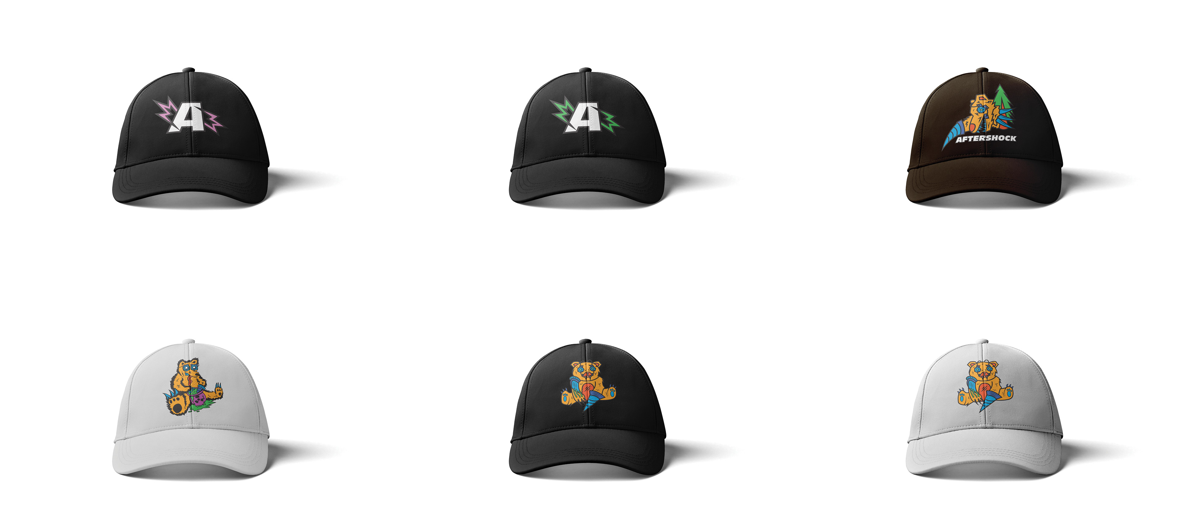
Hats
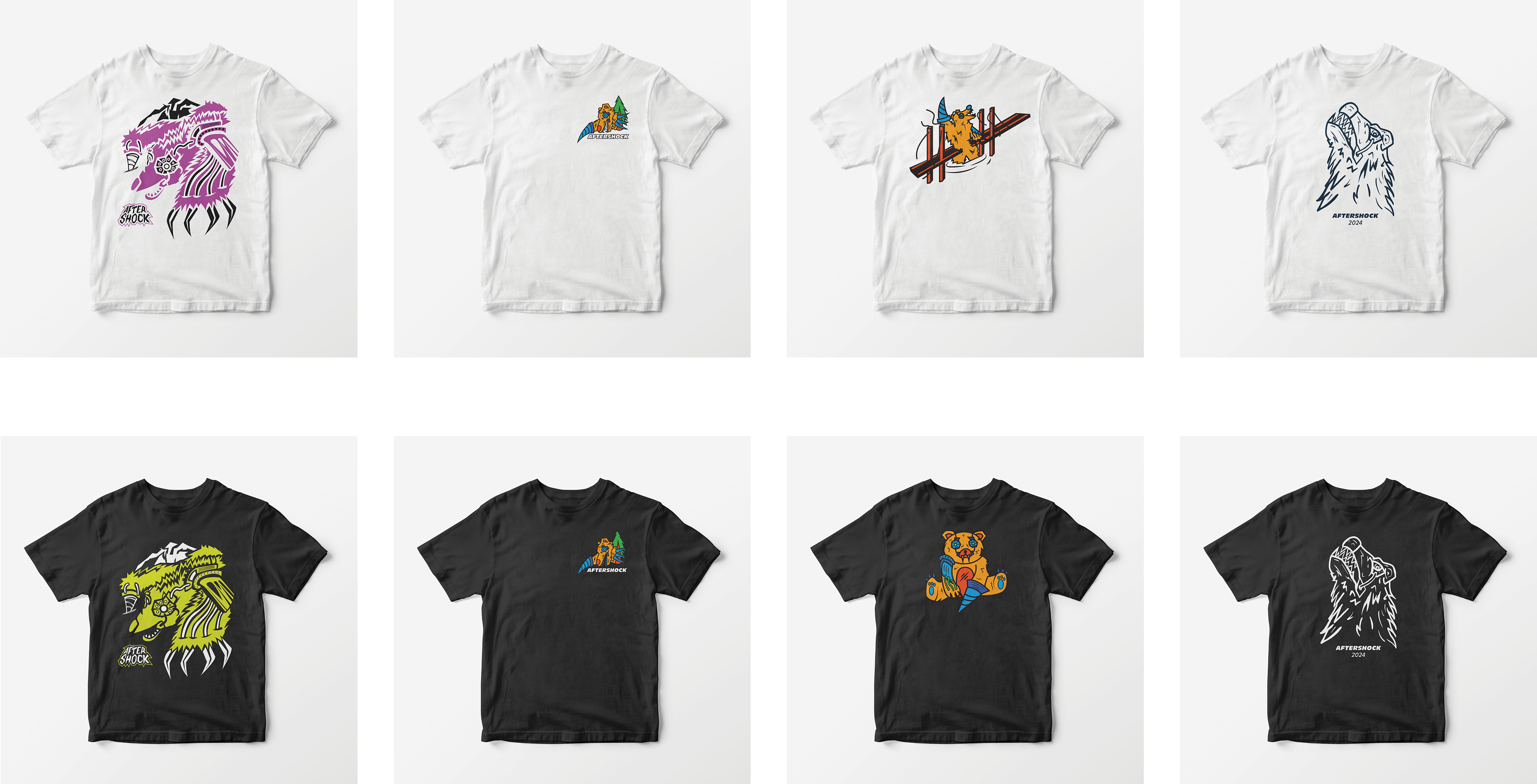
T-Shirts
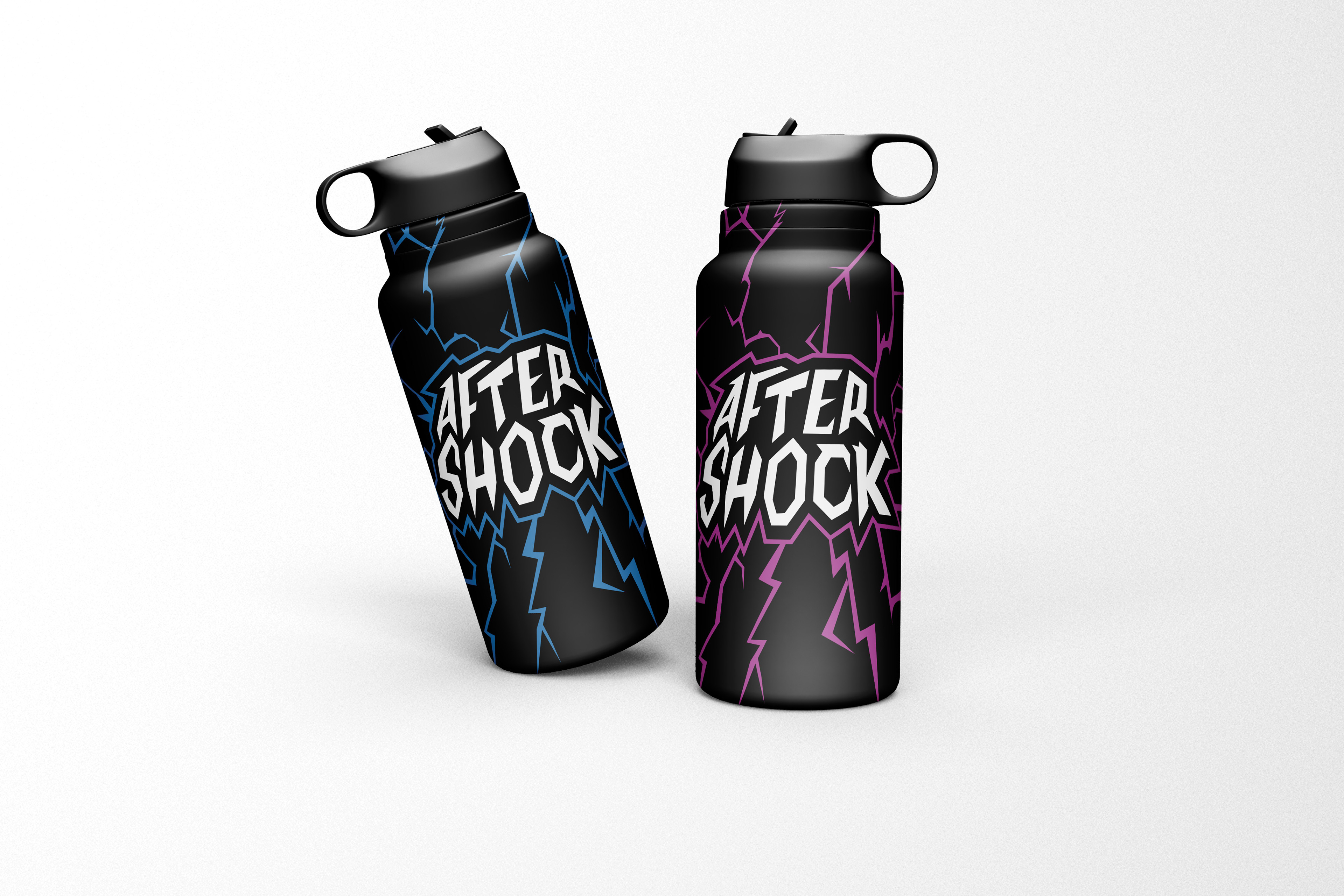
Water Bottles
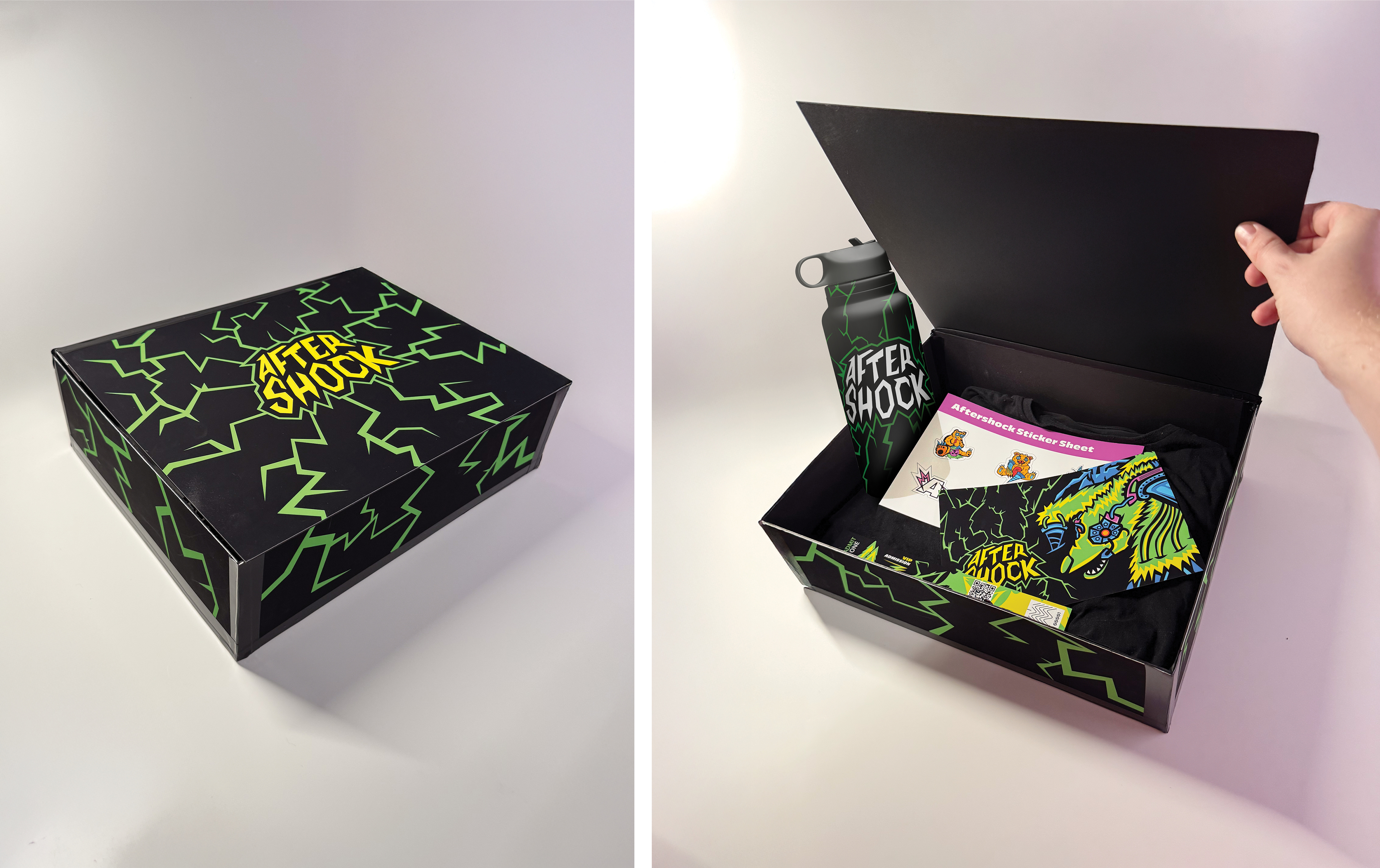
VIP Package
TOUCHPOINT #4: EXPERIENCE
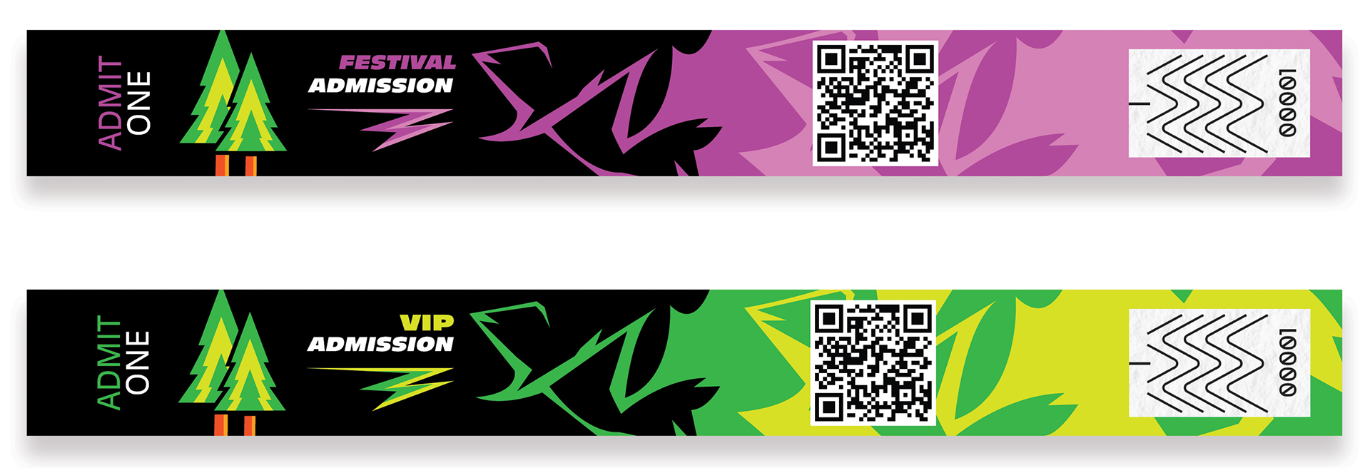
Wristbands
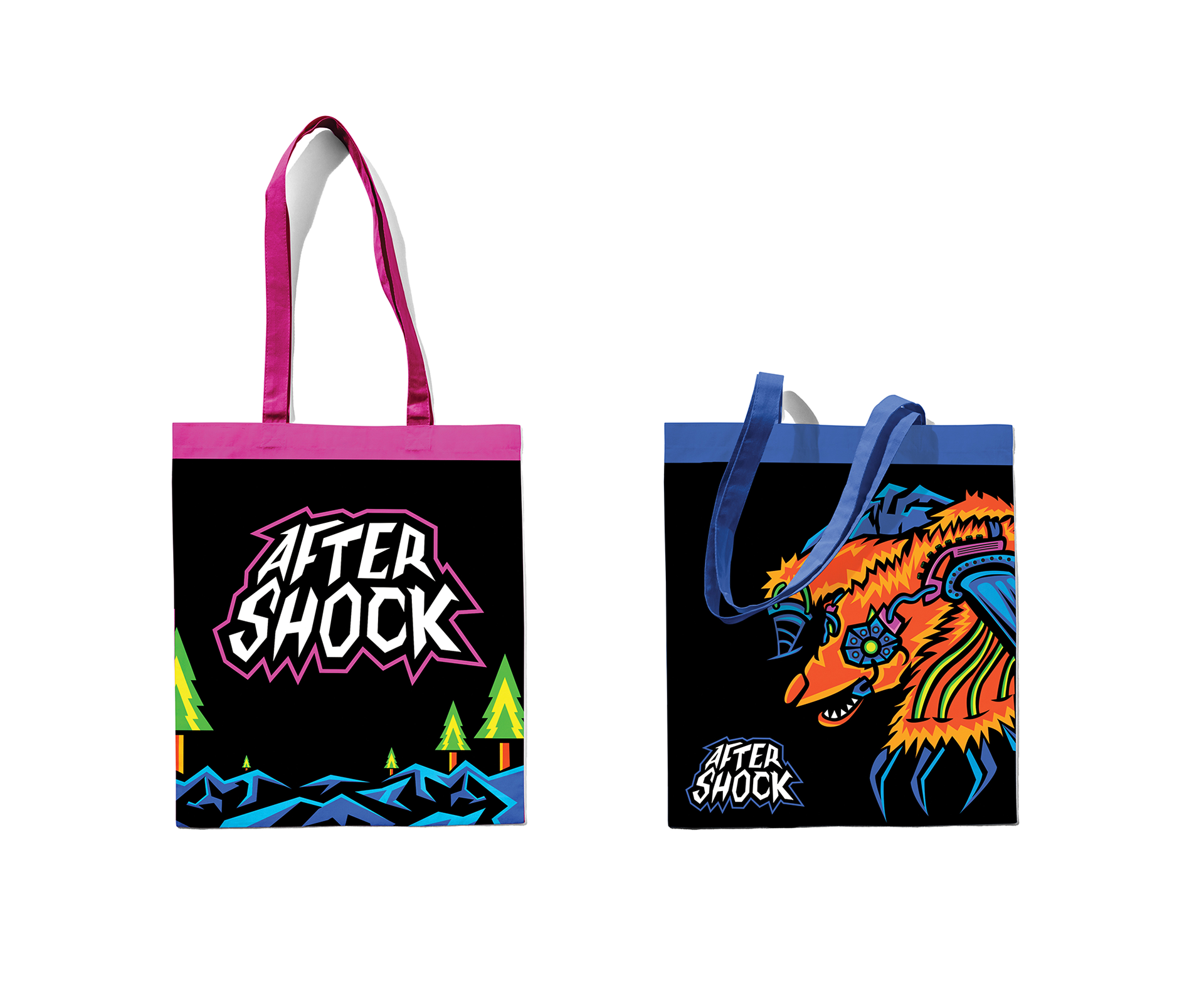
Totes
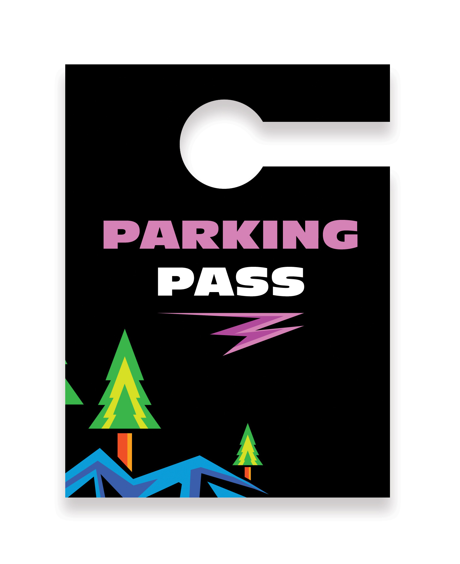
Parking Pass
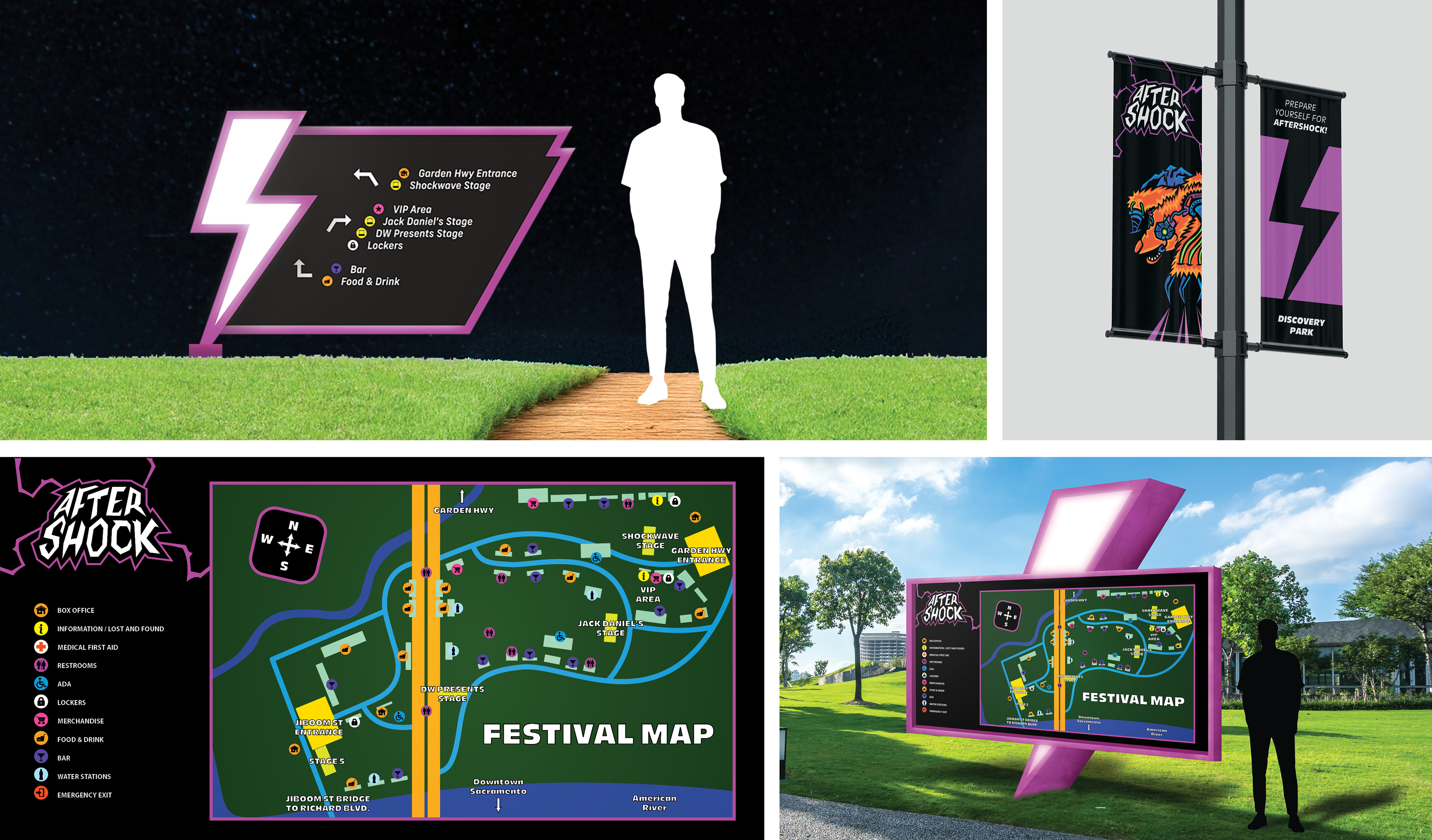
Large-Scale Environmental Design & Map
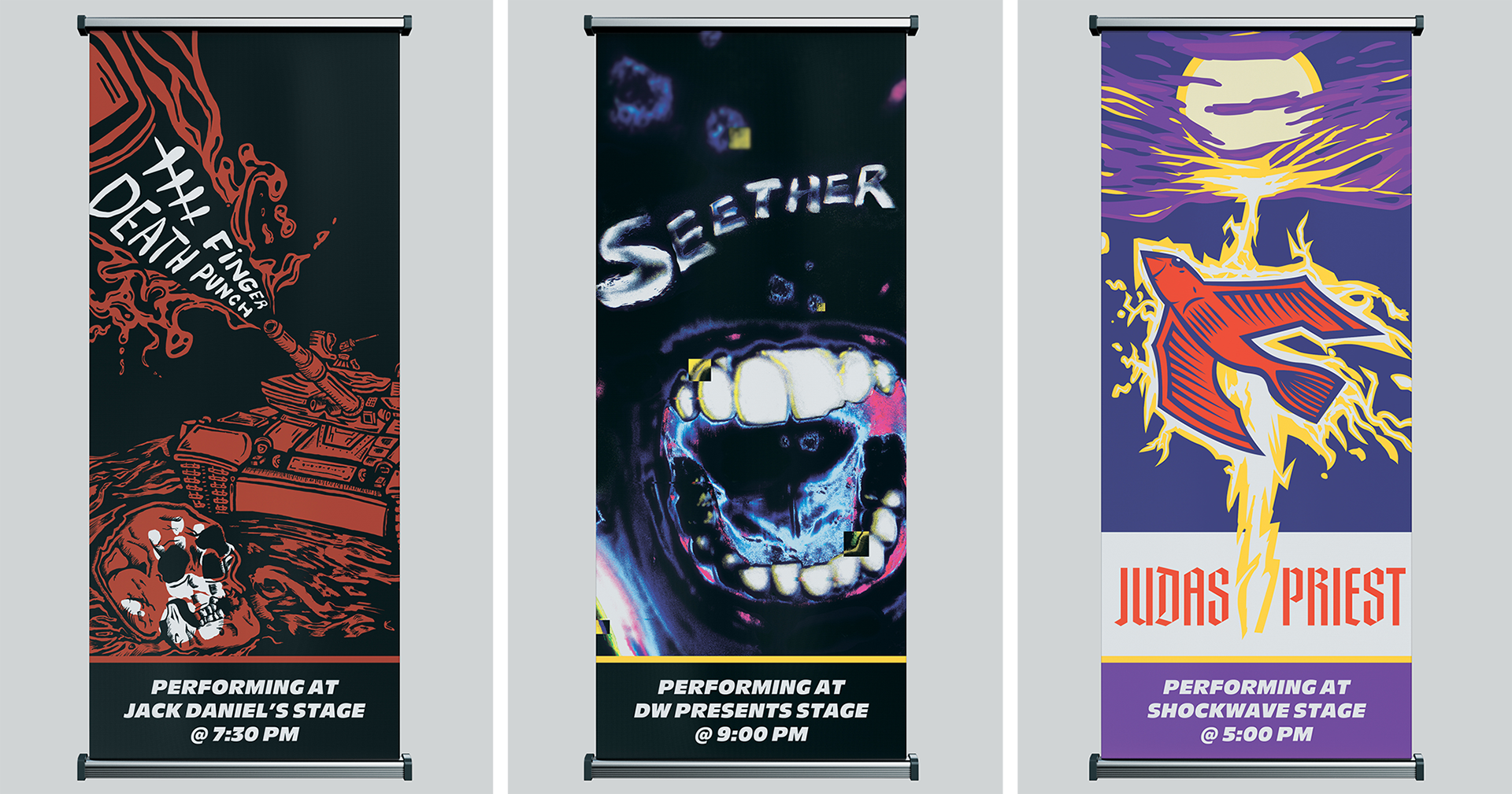
Band Banner System
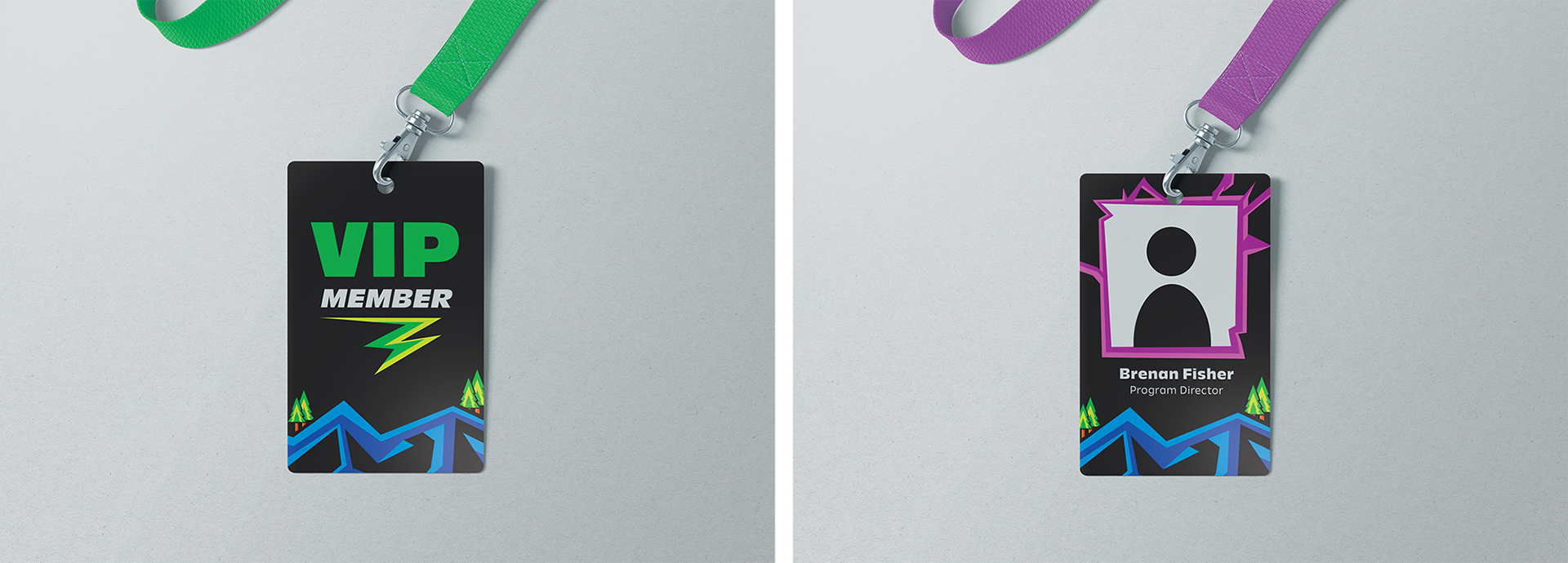
ID Badges
TOUCHPOINT #5: FOLLOW-UP
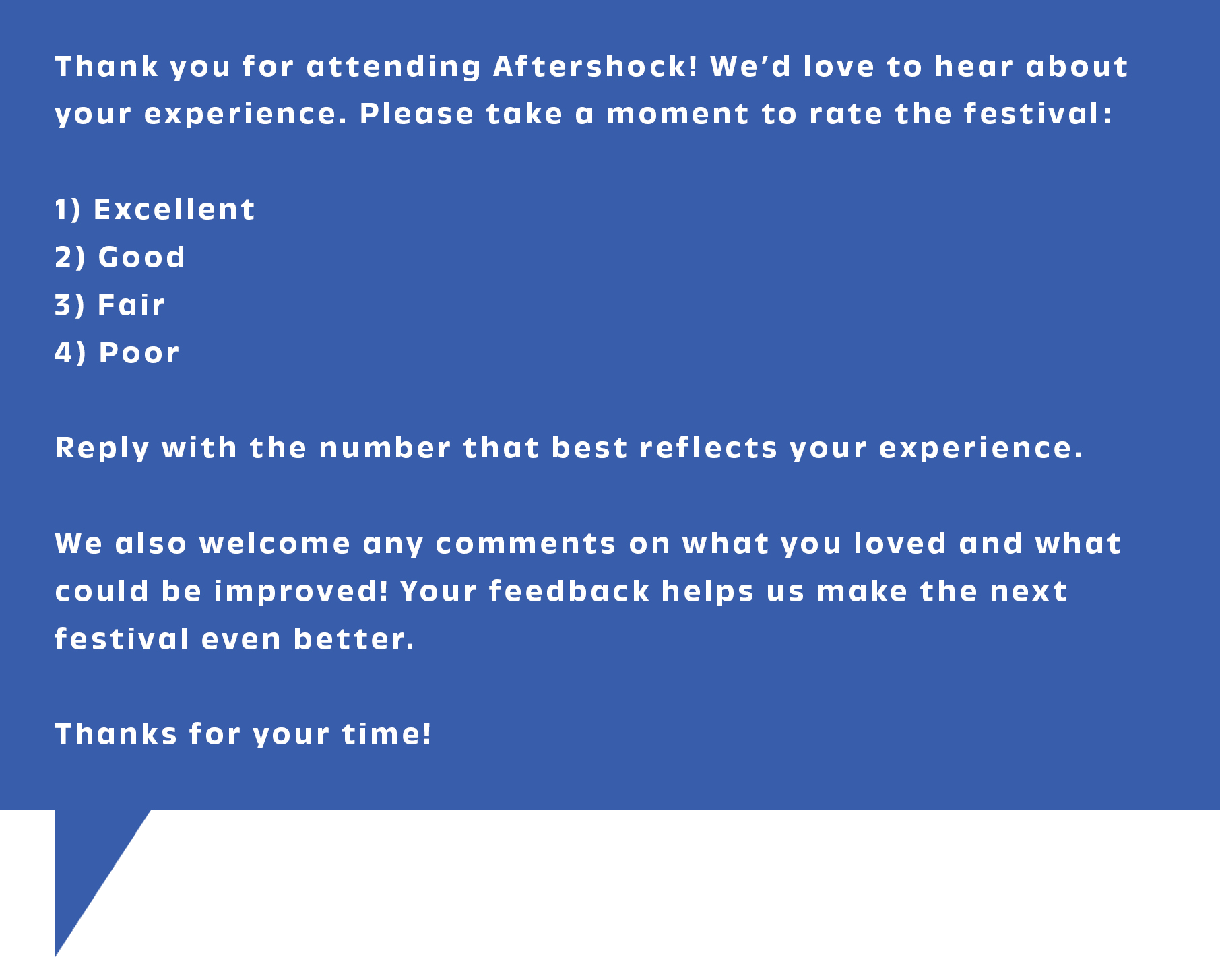
Text Survey
To get feedback on the Aftershock experience from attendees to improve the experience for the next Aftershock, a text survey will be sent out to everyone through text.
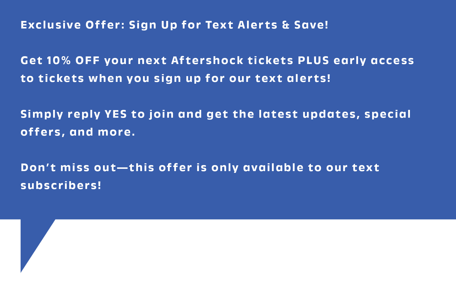
Next Event
To keep interested, those who sign up to stay updated will receive an exclusive 10% discount for the next Aftershock, as well as early ticket-buying access to guarantee a spot at the event. This will also be an opportunity to inform those who sign up about what will be new at the next event, or when the merchandise has dropped.
CONCLUSION
In conclusion, my brand identity was a success in targeting likely and unlikely audiences and maximizing ticket sales, as well as keeping the California bear for brand recognition, but also advancing the brand to a more dynamic and memorable look. If I had to change anything during this process, I would have spent more time on my large-scale environmental signage to improve the wayfinding strategy, and create a larger sign family. I would also spend more time on improving the quality of the web pages, and social media postings.